
For years, “KN” has been used as a Google search term directing you to a car parts company and a German newspaper. Another top search result points to Illinois-based audio technology company Knowles Corporation (NYSE: KN).
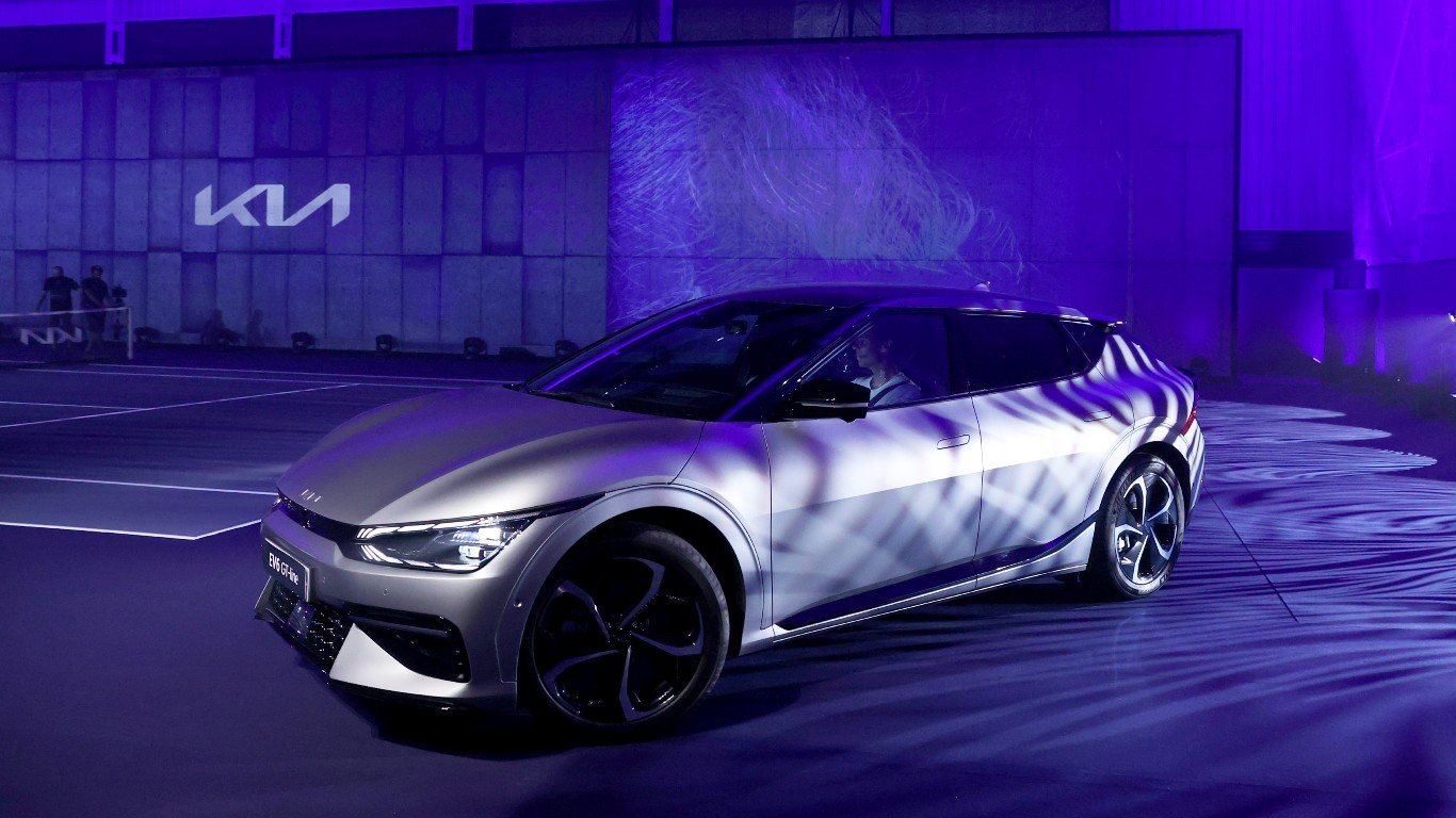
But Google Trends shows the U.S. search term for “KN” peaked at its all-time high in January 2022. It might not be a coincidence this spike took place shortly after South Korean automaker Kia Motors release its 2022 model-year lineup of its cars and SUVs.
These were the first Kia vehicles in the U.S. to feature the company’s new and confusing logo. It may have inspired some people to Google the letters wondering if there was some new car brand out there in the wild. It’s hard to blame them for the confusion.
A typographic car wreck?
![]()
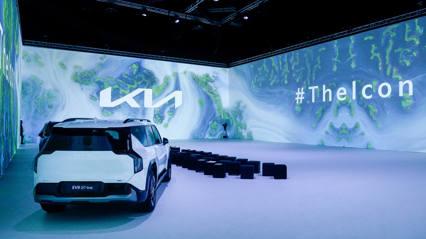
The stylized “K” is somewhat discernible, but the “I” and the “A” is lost in an insignia that depicts an “N” and a backwards “N” at the same time. Some news outlets are saying this one of the worst logo redesigns ever.
Inc. magazine called it confusing, inconsistent with Kia’s brand history, and difficult to reproduce in smaller sizes on merch, promo materials, and with certain printing methods. Compared to Apple’s iconic apple, or the cleverly hidden-in-plain-sight arrow nestled in the FedEx brand mark, Kia’s logo change seems cringe-worthy.
A Kia spokesperson told MotorTrend in April the change represents a move away from “traditional automobile conventions, as many auto brands have used circles or ovals in their logos.” Indeed, the ovals of Ford, Toyota, and Infiniti, and the circles of Mercedes-Benz, BMW, and Volvo, are just a few examples.
But is the logo really that bad?
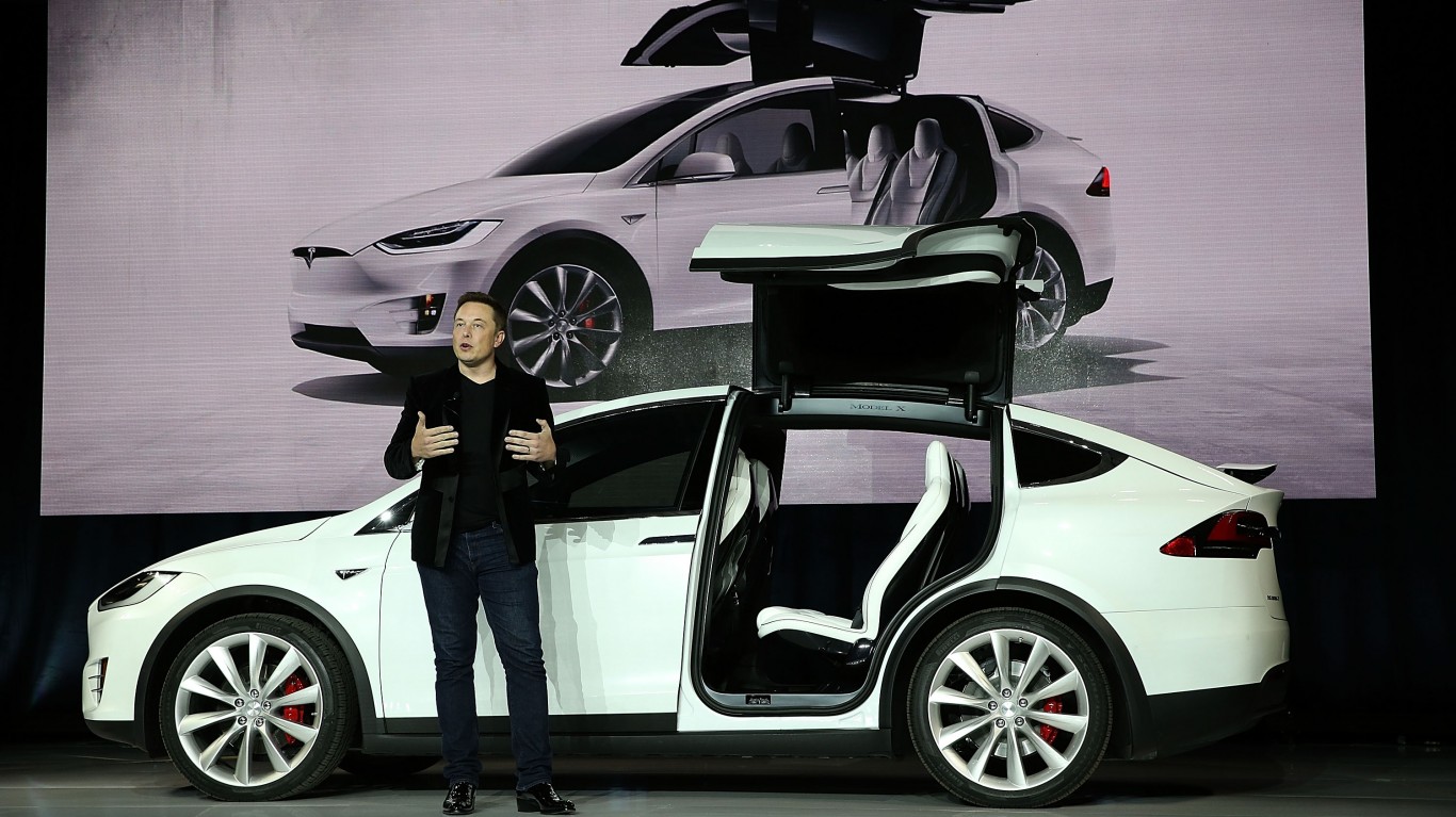
The change may have been lambasted by designers and the media, but it helped the company. Media coverage can be worth more than the benefits of advertising. Automaker Tesla, for example, eschews marketing and relies on the buzz and hype around the company and its obstreperous co-founder Elon Musk to promote its brand.
Kia reported U.S. sales of more than 210,000 vehicles in the three months ending in September. It was an all-time record for the third quarter and the first nine months of the year. Its bestselling models this year in the U.S. is the Sportage and Telluride SUVs.
Whether the logo change was a bad decision or not, ultimately what people are buying is the vehicle not the badge. Kia’s newest best sellers have earned high ratings from Car and Driver magazine.
Not the only recent logo debacle
Ride-hailing company Uber had its own logo-change adventure when it radically rebranded.
In 2016, the company swapped out its recognizable stylized “U” icon for an incomprehensible circle logo with different styles, colors and patterns. The change “celebrates the cities that Uber serves,” according to a post on the company’s website written by co-founder and then-CEO Travis Kalanick.
Two years later, Uber changed its logo again, re-incorporating the company’s name and scrapping the confusing shapes, colors, and patterns. It reintroduced a flat black background and the company’s name, leaving people to wonder if Uber’s two-year logo-change experiment is reminiscent of the old proverb: “If it ain’t broke, don’t’ fix it.”
And then there’s Twitter (X)
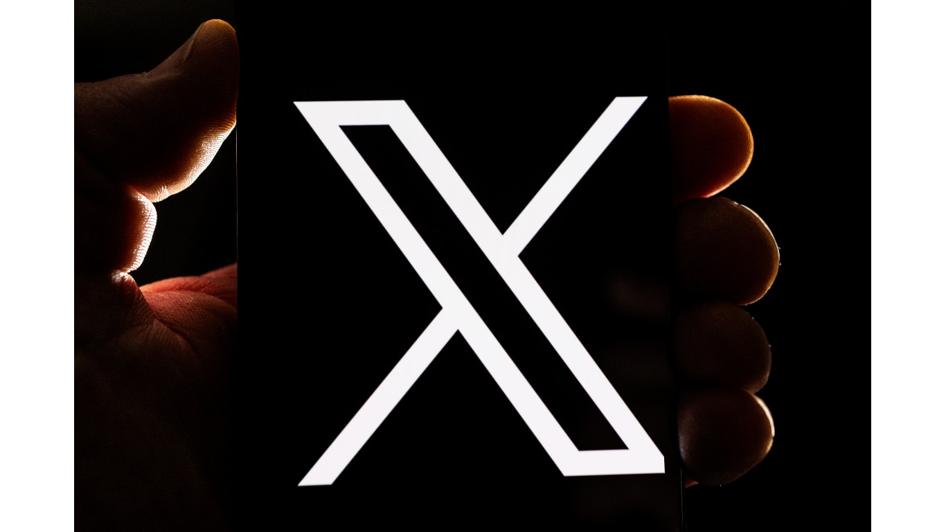
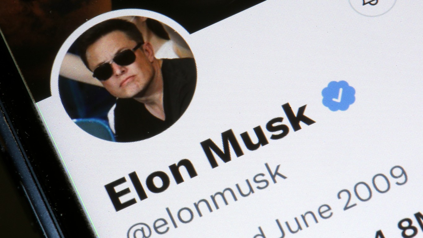
Kia’s logo change may not really be the worst in recent memory. After centibillioniare businessman Elon Musk bought Twitter in October 2022, he killed the platform’s globally recognized blue bird logo for a white “X” on a black background. Musk says it’s a shout-out to Unicode, the text-encoding system originating in the 1980s.
The logo re-design and rollout was sloppy, seemingly originating from Musk’s whims rather than from an organized re-branding strategy. After switching to “X,” Musk briefly changed the letter to a bolder typeface before undoing the change days later. It took longer for the company to change the verb “tweet” to “post” on its site, and for the new logo to seed itself across the internet. The word “Twitter” still appears below the pinned X logo button on the Firefox browser.
According to brand analysts that spoke to Time magazine in July, the changes wiped out billions of dollars’ worth of Twitter’s brand equity built over 15 years.
Contact [email protected] for any questions or corrections.