

[cnxvideo id=”924890″ placement=”ros”]
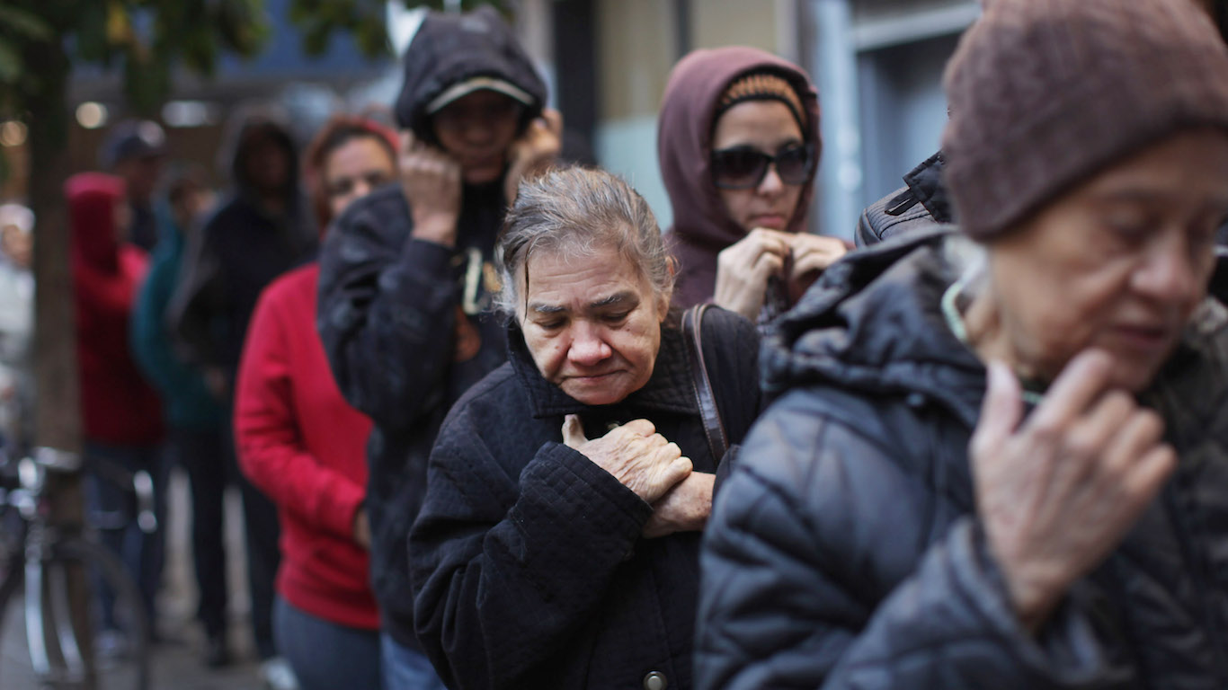
Since the end of the financial crisis, the United States has experienced unprecedented economic growth and reached the lowest unemployment rate in 50 years. While common indicators suggest the U.S. economy is prospering, major headlines often overlook one of the most important determinants of economic well-being: economic segregation.
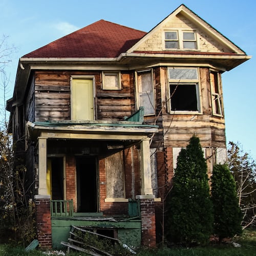
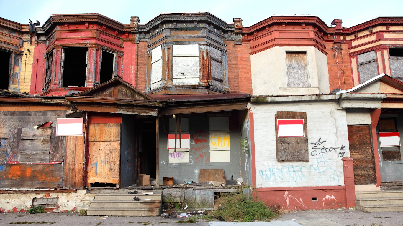
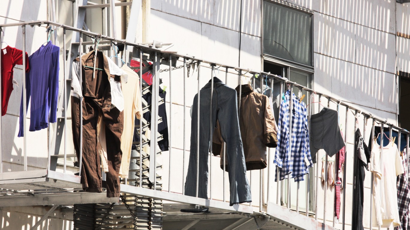
One of the most common consequences of economic growth in cities is the displacement of low-income residents into poor, declining neighborhoods. Another common occurrence is the migration of more affluent residents out of poorer neighborhoods, leaving behind only very low-income residents. These phenomena can occur even as the official poverty rate in a city stays the same, or even increases.
In most U.S. metro areas, changes in the concentrated poverty rate mirror those of the official poverty rate. That is, the share of poor residents in poor neighborhoods increases as the overall share of individuals living in poverty increases, and vice versa. In some extreme cases, however, the concentrated poverty rate rises even as the overall poverty declines.
In a slate of recent studies, researchers have shown how those living in concentrated poverty — people living below the poverty line in neighborhoods where at least 40% of residents are also poor — often have limited access to economic resources and are less likely to break the cycle of poverty than poor people living in wealthier neighborhoods. Click here to see the cities hit hardest by concentrated poverty in every state.
To determine the cities where poverty is flat or down but where poverty is becoming more concentrated, 24/7 Wall St. analyzed changes in the distribution of poverty in U.S. metro areas from 2011 to 2017, using five-year data from the U.S. Census Bureau’s American Community Survey. In these metro areas, the official poverty rate — the share of residents with income below the poverty line — fell, while the share of poor residents living in poor neighborhoods increased.
Click here to see the full list of cities where poverty down, but where the problems for the poor are getting worse
Click here to read our detailed findings and methodology

19. Portland-Vancouver-Hillsboro, OR-WA
> Chg. in extreme poverty rate, 2011-17: +0.9 ppts (+2,674 people)
> Chg. in official poverty rate, 2011-17: -0.4 ppts (+13,899 people)
> Unemployment in extreme poverty neighborhoods: 10.5%
> Avg. income in extreme poverty neighborhoods: $43,881
Portland is one of several cities with a strong economy that has attracted young, wealthy residents. The fast population growth contributed to increased home values and rising incomes. The population of Portland rose by 8.2% from 2011 to 2017, nearly twice the 4.8% national rate, and the poverty rate fell slightly, from 12.6% to 12.3%.
Like many cities with rapid population increases, however, growth in Portland may also be contributing to economic segregation as rising home values force poor residents into less expensive neighborhoods. The number of census tracts in which at least 40% of residents live below the poverty line in Portland rose from three in 2011 to four in 2017, and the share of poor residents living in those neighborhoods rose from 1.4% to 2.3%.
[in-text-ad]
18. Greenville, NC
> Chg. in extreme poverty rate, 2011-17: +0.9 ppts (+793 people)
> Chg. in official poverty rate, 2011-17: -0.4 ppts (+1,779 people)
> Unemployment in extreme poverty neighborhoods: 12.0%
> Avg. income in extreme poverty neighborhoods: $43,533
From 2011 to 2017, the population of Greenville rose by 7.0%, and the average household income rose by 13.4% — each greater than the corresponding national rates. Over the same period, the share of residents living below the poverty line fell from 23.2% to 22.8%.
As Greenville’s income increased and poverty rate declined, many of its poorest residents were displaced to live in poor neighborhoods. While the number of census tracts in Greenville where at least 40% of residents live below the poverty line fell from five in 2011 to four in 2017, the share of poor residents living in those tracts — the concentrated poverty rate — rose from 25.6% to 26.5%.
[recirclink id=534369]

17. Greenville-Anderson-Mauldin, SC
> Chg. in extreme poverty rate, 2011-17: +0.5 ppts (+754 people)
> Chg. in official poverty rate, 2011-17: -0.9 ppts (+1,248 people)
> Unemployment in extreme poverty neighborhoods: 9.5%
> Avg. income in extreme poverty neighborhoods: $34,192
Since 2011, the population of Greenville has risen by 6.8%, faster than a majority of midsize metro areas. The average household income rose by approximately $6,500, unemployment fell from 9.6% to 6.1%, and the official poverty rate fell from 15.8% to 14.9%.
While Greenville has experienced substantial economic growth in the wake of the financial crisis, not all residents in the area have prospered. From 2011 to 2017, the share of poor residents living in poor neighborhoods in Greenville — the concentrated poverty rate — rose from 10.5% to 11.0%. Living in a poor neighborhood can add an extra burden to those living below the poverty line, as poor neighborhoods often lack economic resources and access to education and job opportunities.

16. Ogden-Clearfield, UT
> Chg. in extreme poverty rate, 2011-17: +1.4 ppts (+915 people)
> Chg. in official poverty rate, 2011-17: -0.4 ppts (+2,647 people)
> Unemployment in extreme poverty neighborhoods: 14.6%
> Avg. income in extreme poverty neighborhoods: $32,750
The poverty rate in the Ogden metro area fell slightly from 9.1% in 2011 to 8.7% in 2017. While the official poverty rate has improved since the financial crisis, the spatial distribution of poverty has worsened as poor residents have become more concentrated in poor areas. The share of residents in the Ogden metro area living in neighborhoods where at least 40% of the population lives below the poverty line rose from 5.1% to 6.5%
Concentrated poverty can reduce access to education and job opportunities for poor residents and further contribute to socioeconomic inequality. While some 30.4% of adults in Ogden have a bachelor’s degree, just 9.6% of adults in poor neighborhoods do, a greater disparity than the national gap in college attainment.
[in-text-ad-2]

15. Boise City, ID
> Chg. in extreme poverty rate, 2011-17: +1.7 ppts (+1,557 people)
> Chg. in official poverty rate, 2011-17: -0.1 ppts (+7,872 people)
> Unemployment in extreme poverty neighborhoods: 3.9%
> Avg. income in extreme poverty neighborhoods: $36,768
Boise City’s population growth of 10.5% from 2011 to 2017 is more than double the national growth rate of 4.8%. As wealthy residents moved into Boise City, home values rose, and many of the city’s poorest residents were likely displaced into poor neighborhoods. The share of the poor population living in poor neighborhoods in Boise City rose from 0.6% in 2011 to 2.3% in 2017 — a net total of 1,557 new poor residents.
Economic segregation can reinforce the cycle of poverty and contribute to socioeconomic inequality. In Boise City, income inequality — as measured by the Gini Index — increased by 5.2% from 2011 to 2017, more than twice the national increase.

14. Augusta-Richmond County, GA-SC
> Chg. in extreme poverty rate, 2011-17: +1.5 ppts (+1,929 people)
> Chg. in official poverty rate, 2011-17: -0.5 ppts (+3,080 people)
> Unemployment in extreme poverty neighborhoods: 17.8%
> Avg. income in extreme poverty neighborhoods: $31,579
The poverty rate in the Augusta metro area fell from 18.5% in 2011 to 18.1% in 2017, a greater decline than the United States as a whole. While the official poverty rate improved in Augusta, the concentration of poverty worsened. The number of neighborhoods in Augusta where at least two in five residents are poor rose from eight in 2011 to nine in 2017, and the share of poor residents living in those neighborhoods increased from 13.4% to 14.8%. By comparison, over the same period, the national concentrated poverty rate fell from 11.8% to 10.9%.
[in-text-ad]

13. Columbia, MO
> Chg. in extreme poverty rate, 2011-17: +2.1 ppts (+871 people)
> Chg. in official poverty rate, 2011-17: -0.7 ppts (+1,218 people)
> Unemployment in extreme poverty neighborhoods: 8.7%
> Avg. income in extreme poverty neighborhoods: $44,485
The population of the Columbia metro area increased by 8.6% from 2011 to 2017, nearly twice the 4.8% national growth rate. Over the same period, the share of residents living below the poverty line fell slightly from 17.0% to 16.3%. While the official poverty rate in Columbia improved, the distribution of poverty became more concentrated. Although the number of census tracts in which at least 40% of residents live below the poverty line fell from three in 2011 to two in 2017, the share of poor residents living in those neighborhoods rose from 20.5% to 22.6%. In contrast, the national concentrated poverty rate fell from 11.8% to 10.9% over the same period.
[recirclink id=561780]
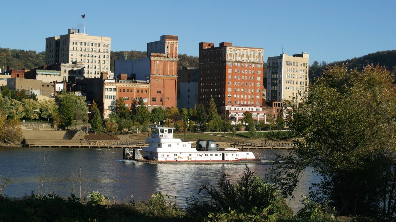
12. Wheeling, WV-OH
> Chg. in extreme poverty rate, 2011-17: +2.9 ppts (+473 people)
> Chg. in official poverty rate, 2011-17: -0.9 ppts (-1,923 people)
> Unemployment in extreme poverty neighborhoods: 10.7%
> Avg. income in extreme poverty neighborhoods: $34,863
Wheeling is one of the metro areas on this list where a population decline is contributing to the increased concentration of poor residents in poor neighborhoods. The population of Wheeling fell by 3.2% from 2011 to 2017, and the number of poor residents declined by a net total of approximately 1,900.
Population decline is often driven by the outbound migration of a city’s wealthiest residents, and this can increase the concentration of poverty in urban areas. Although the total number of residents living in poverty in Wheeling fell over the past several years, the number of neighborhoods in which at least 40% of residents live in poverty rose from two to three, and the share of poor residents living in such neighborhoods rose from 4.9% to 7.9%.
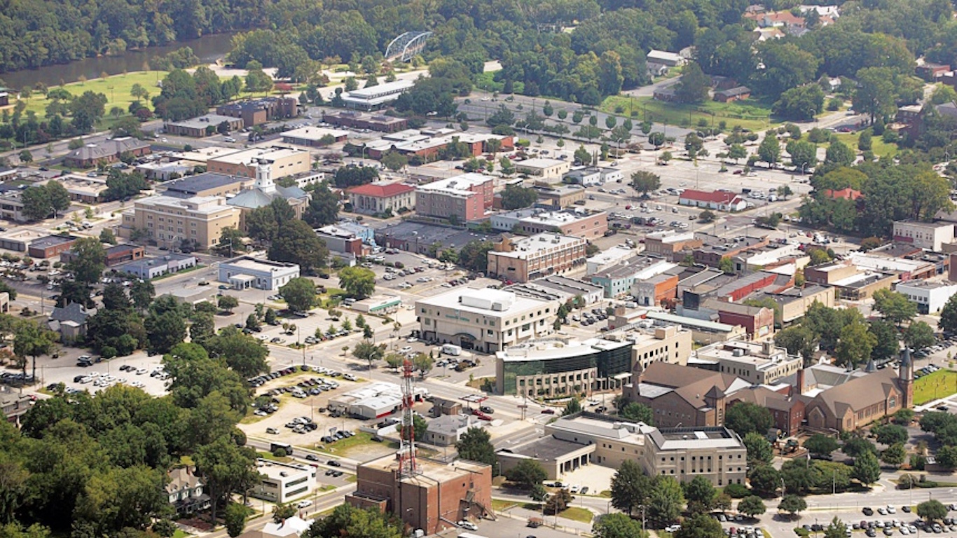
11. Fort Collins, CO
> Chg. in extreme poverty rate, 2011-17: +4.6 ppts (+2,149 people)
> Chg. in official poverty rate, 2011-17: -0.4 ppts (+3,378 people)
> Unemployment in extreme poverty neighborhoods: 7.6%
> Avg. income in extreme poverty neighborhoods: $47,090
One of the fastest growing metro areas in the country, the population of Fort Collins grew by 13.3% from 2011 to 2017, nearly three times the national rate. Home values rose by 23.5%, nearly four times the national figure.
As the city’s population grew and home values rose, however, many of the poorest residents were likely forced to move to less expensive neighborhoods. While from 2011 to 2017 the official poverty rate in Fort Collins fell from 12.8% to 12.3%, the share of poor residents living in neighborhoods where 40% of the population is also poor — the concentrated poverty rate — rose from 9.8% to 14.4%.
[in-text-ad-2]

10. Oklahoma City, OK
> Chg. in extreme poverty rate, 2011-17: +5.1 ppts (+10,576 people)
> Chg. in official poverty rate, 2011-17: -0.3 ppts (+12,956 people)
> Unemployment in extreme poverty neighborhoods: 9.9%
> Avg. income in extreme poverty neighborhoods: $36,956
The Oklahoma City metro area population growth of 9.5% from 2011 to 2017 is more than twice the national growth rate of 4.8%. Over the same period, the average home value increased by 16.3% — more than twice the increase in home values nationwide of 6.5% — and the official poverty rate fell slightly from 14.8% to 14.5%
While the poverty rate in Oklahoma City has improved, the concentration of poverty has worsened. From 2011 to 2017, the share of poor residents living in neighborhoods where 40% of the population is also poor — the concentrated poverty rate — rose from 6.9% to 11.9%. The increase was likely due in part to rising home values, which can confine poor residents to less expensive neighborhoods and cut off access to various economic opportunities.
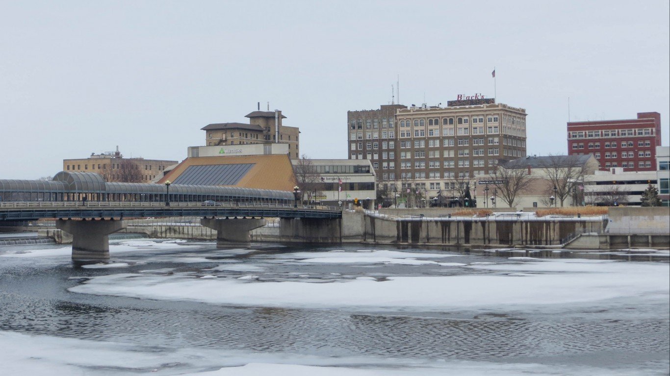
9. Waterloo-Cedar Falls, IA
> Chg. in extreme poverty rate, 2011-17: +5.5 ppts (+1,163 people)
> Chg. in official poverty rate, 2011-17: -0.8 ppts (-623 people)
> Unemployment in extreme poverty neighborhoods: 21.5%
> Avg. income in extreme poverty neighborhoods: $36,525
The value of the average home in the Waterloo metro area rose from $151,722 in 2011 to $165,791 in 2017, a 23.1% increase — nearly four times the 6.5% national increase in home value. One common consequence of rising home values in urban areas is the displacement of a city’s low-income population, as poor residents become more restricted in the neighborhoods they can afford.
In Waterloo, the number of neighborhoods in which at least 40% of residents live below the poverty line rose from one in 2011 to three in 2017. While the official poverty rate in the metro area fell during this time, the share of the poor population living in poor neighborhoods — the concentrated poverty rate — rose from 3.9% to 9.4%.
[in-text-ad]
8. Killeen-Temple, TX
> Chg. in extreme poverty rate, 2011-17: +7.2 ppts (+4,146 people)
> Chg. in official poverty rate, 2011-17: -0.5 ppts (+2,220 people)
> Unemployment in extreme poverty neighborhoods: 16.1%
> Avg. income in extreme poverty neighborhoods: $34,912
The population of the Killeen-Temple metro area rose by 8.0% from 2011 to 2017, far more than the 4.8% national population growth rate. Over the same period, the average home value rose by 21.5% — compared to the corresponding national increase of 6.5% — and the official poverty rate fell from 14.6% to 14.0%.
Rising real estate values often confine a city’s poorest residents to less expensive neighborhoods and can contribute to economic segregation. The number of census tracts in Killeen in which at least 40% of residents live below the poverty line rose from one in 2011 to five in 2017. The share of the poor population living in those tracts rose from 2.4% to 9.6%, one of the larger increases in concentrated poverty of any city.
7. Watertown-Fort Drum, NY
> Chg. in extreme poverty rate, 2011-17: +8.5 ppts (+1,368 people)
> Chg. in official poverty rate, 2011-17: -0.3 ppts (-500 people)
> Unemployment in extreme poverty neighborhoods: 8.9%
> Avg. income in extreme poverty neighborhoods: $43,094
Watertown is one of several metro areas in which a population decline since the Great Recession has contributed to a rise in concentrated poverty. The population of the Watertown-Fort Drum metro area fell 0.9% from 2011 to 2017, one of the larger declines of any U.S. city.
Population decline is often caused by the outbound migration of a city’s high-income population, and it is one of the main drivers of poverty concentration. The number of census tracts in Watertown in which at least 40% of residents live in poverty rose from zero in 2011 to one in 2017, and the share of poor residents living in those neighborhoods rose from 0.0% to 8.5%.
[in-text-ad-2]
6. Bowling Green, KY
> Chg. in extreme poverty rate, 2011-17: +8.7 ppts (+2,847 people)
> Chg. in official poverty rate, 2011-17: -0.3 ppts (+1,623 people)
> Unemployment in extreme poverty neighborhoods: 6.6%
> Avg. income in extreme poverty neighborhoods: $33,263
The population of the Bowling Green metro area rose by 7.7% from 2011 to 2017, far more than the 4.8% national population growth rate. Over the same period, the value of the average home rose by 14.9%, and the official poverty rate fell slightly from 18.9% to 18.5%.
One common consequence of economic growth in neighborhoods is the displacement of low-income residents. When home values rise, this limits affordable housing options for poor residents and confines them to less expensive neighborhoods. In Bowling Green, the number of neighborhoods where at least 40% of the population lives below the poverty line rose from three in 2011 to five in 2017. The share of the poor population living in those neighborhoods rose from 15.4% to 24.1%, one of the largest increases of any metro area.
5. Pittsfield, MA
> Chg. in extreme poverty rate, 2011-17: +10.2 ppts (+1,404 people)
> Chg. in official poverty rate, 2011-17: -0.5 ppts (-1,137 people)
> Unemployment in extreme poverty neighborhoods: 22.6%
> Avg. income in extreme poverty neighborhoods: $33,317
The population of the Pittsfield metro area fell by 3.6% from 2011 to 2017, the 11th largest decline of any U.S. city. Over the same period, the poverty rate fell from 11.8% to 11.3% — a decline of approximately 1,100 poor residents.
While the total number of residents living below the poverty line fell, the number of poor residents living in poor neighborhoods — concentrated poverty — increased. The number of census tracts in which at least 40% of residents earn poverty wages in Pittsfield rose from zero in 2011 to one in 2017, and the share of poor residents living in those neighborhoods rose from 0.0% to 10.2%.
[in-text-ad]

4. Great Falls, MT
> Chg. in extreme poverty rate, 2011-17: +11.2 ppts (+1,164 people)
> Chg. in official poverty rate, 2011-17: -0.8 ppts (-508 people)
> Unemployment in extreme poverty neighborhoods: 5.0%
> Avg. income in extreme poverty neighborhoods: $61,150
The population of Great Falls fell by 8.4% from 2011 to 2017, one of the largest declines of any U.S. metro area. Urban population decline is often driven by outbound migration of a city’s wealthiest residents and can significantly alter the spatial distribution of poverty in a metro area. With the departure of wealthy residents, the number of neighborhoods in Great Falls in which more than 40% of the population lives below the poverty line rose from zero in 2011 to one in 2017, and
the share of poor residents living in such neighborhoods rose from 0.0% to 11.2%.
Concentrated poverty can limit access to economic resources for poor residents and contribute to income inequality. Since 2011, income inequality — as measured by the Gini Index — has risen more in Great Falls than in any other U.S. metro area.
[recirclink id=545465]

3. Bangor, ME
> Chg. in extreme poverty rate, 2011-17: +14.6 ppts (+3,251 people)
> Chg. in official poverty rate, 2011-17: -0.5 ppts (-885 people)
> Unemployment in extreme poverty neighborhoods: 11.5%
> Avg. income in extreme poverty neighborhoods: $41,807
Bangor is one of many Northeastern metro areas experiencing a rapid decline in population. While nationwide the U.S. population rose by 4.8% from 2011 to 2017, the population of Bangor fell by 0.8%. Population decline is often led by those who can afford to move outside of a given city, leaving the poorer residents who remain with a smaller tax base and reduced access to economic opportunity.
The outbound migration of wealthier residents is likely one reason the number of neighborhoods in Bangor in which at least 40% of residents live below the poverty line rose from zero in 2011 to one in 2017. At the same time, the number of poor residents living in such neighborhoods rose from 0.0% to 14.6% — one of the largest increases of any metro area.
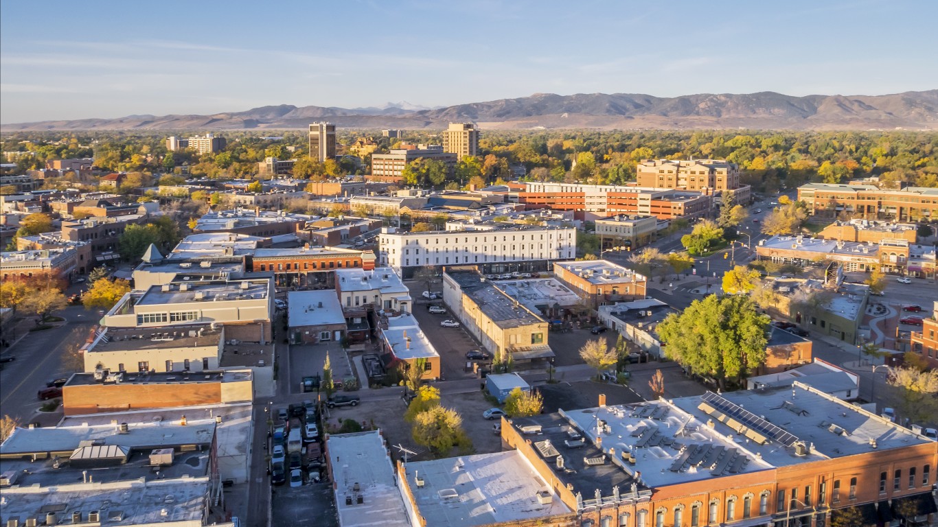
2. Boulder, CO
> Chg. in extreme poverty rate, 2011-17: +15.2 ppts (+5,011 people)
> Chg. in official poverty rate, 2011-17: -0.3 ppts (+1,512 people)
> Unemployment in extreme poverty neighborhoods: 4.8%
> Avg. income in extreme poverty neighborhoods: $64,804
Boulder is one of several fast-growing cities in which an influx of young, wealthy residents is contributing to increased home values, rising incomes, and falling poverty. The population of Boulder rose by 7.5% from 2011 to 2017, far more than the 4.8% national rate. Also, the average home value rose by 21.3%, more than three times the 6.5% national figure.
While inclusionary housing regulations and housing authorities like Boulder Housing Partners help keep real estate affordable for the city’s low-income population, many of the city’s poorest residents appear to have been displaced due to its rapid growth. The number of neighborhoods in which at least 40% of residents live below the poverty line in Boulder rose from zero in 2011 to three in 2017, and the concentrated poverty rate rose from 0.0% to 15.2%.
[in-text-ad-2]

1. Lawton, OK
> Chg. in extreme poverty rate, 2011-17: +19.2 ppts (+3,803 people)
> Chg. in official poverty rate, 2011-17: -0.1 ppts (+293 people)
> Unemployment in extreme poverty neighborhoods: 12.6%
> Avg. income in extreme poverty neighborhoods: $37,403
The share of residents living in poverty in Lawton fell slightly from 16.6% in 2011 to 16.7% in 2017. As incomes rose and the official poverty rate in Lawton improved, however, the spatial distribution of poverty became more uneven. While in 2011 there were no neighborhoods in Lawton where at least 40% of residents lived below the poverty line, by 2017 there were four. The share of poor residents living in those neighborhoods rose from 0.0% to 19.2% — the largest increase of any metro area with a concurrent decline in poverty.
Economic segregation can reinforce the cycle of poverty and contribute to socioeconomic inequality. In Lawton, income inequality — as measured by the Gini Index — rose by 5.8% from 2011 to 2017, one of the largest increases of any U.S. metro area.
Detailed Findings
Many of the cities where poverty is flat or down but where the poor are getting poorer are fast-growing metro areas where an influx of young, wealthy residents is contributing to rising incomes — and lower poverty — and to rising home values.
Rising home values in America’s fastest growing cities often limit the housing options available to the low-income families and confine poor residents to less expensive neighborhoods. Some of the major cities on this list where displacement-driven concentrated poverty is most apparent include Portland and Boulder.
Poverty concentration can also be caused by population decline. Population decline in America’s fastest shrinking cities is often driven by the outbound migration of a metro area’s wealthiest residents, while the low-income residents who cannot afford to relocate stay in place. When the overall number of residents declines but the size of the poor population remains the same, the number of neighborhoods in which at least 40% of residents are poor may rise as often would the share of poor people living in those neighborhoods, thus increasing the concentrated poverty rate. Cities in which the population decline was accompanied by an increase in concentrated poverty include Wheeling, Virginia; Watertown, New York; Pittsfield, Massachusetts; and Bangor, Maine.
Concentrated poverty reduces access to education and job opportunities and is one of the principal drivers of economic inequality. Nationwide, individuals living in poverty tracts are more than twice as likely to be unemployed and to not have a bachelor’s degree as the average American. Similarly, the average household in a poverty tract earns approximately $46,000 less a year than the average income for all U.S. households. In several metro areas on this list, the increase in concentrated poverty was accompanied by nation-leading increases in income inequality, as measured by the Gini Index.
Methodology
To determine the cities where poverty is down but the poor are getting poorer, 24/7 Wall St. identified metropolitan areas where the official poverty rate decreased by at least 0.1% while the concentrated poverty rate increased from 2011 to 2017. In these 19 metro areas, there was at least a 1 percentage point differential between the decrease in the official poverty rate and the increase in the concentrated poverty rate.
The concentrated poverty rate is defined as the share of the population living below the poverty line in census tracts where at least 40% of residents are also living below the poverty line. In our analysis, poverty rates were aggregated to the metropolitan area level using boundary definitions from the U.S. Census Bureau. For the measures of both the official poverty rate and the concentrated poverty rate, only census tracts with at least 500 residents and where less than 50% of the population was enrolled in college were considered, to avoid areas with many college students that can skew the data.
Data came from the U.S. Census Bureau’s American Community Survey are five-year averages for the years 2007 to 2011 and 2013 to 2017. Data on unemployment, income, average home value, and college attainment also came from the ACS and were aggregated from census tracts to the metropolitan level using the same criteria as in the measure of the official and concentrated poverty rates.