Every Best Places to Retire List Ranks the Same Towns. Retirees Who Moved to One Say What the Lists Leave Out
Retirement ranking lists agree on the same Sun Belt towns, but the retirees who actually moved there keep finding costs and trade-offs the spreadsheets never counted. Here is what the metrics quietly leave on the table.

This post may contain links from our sponsors and affiliates, and Flywheel Publishing may receive compensation for actions taken through them.

The same towns keep showing up on lists of the best places to retire: low-tax Sun Belt communities, mountain towns, and college towns with good hospitals. Those rankings can tell you a lot, but they leave out what retirees notice after they move. That gap can show up in the cost of making the move, too.
Why Every List Converges on the Same Towns
These rankings rely on public data pulled from a relatively small group of sources. For its list of the best place to retire in each state, this publication used 11 measures, including primary care doctors per 100,000 residents, median home value, the share of residents age 65 and older, air quality, and the number of golf courses per 10,000 square miles.
A popular ranking site, Niche, considers housing affordability, health care access, climate, and overall quality of life. Overall cost-of-living data typically comes from the Bureau of Economic Analysis’s regional price parities, where 100 equals the national price level. Taxes come from state competitiveness indexes, which ranked Wyoming, South Dakota, and Alaska first through third and Florida 4. When most publishers weight similar inputs from the same datasets, they land on the same answers.
Where the Metrics Miss What Retirees Live With
Price parities measure a broad consumer basket, and housing drives much of the spread: California’s rent parity was 154.3 and West Virginia’s 54.2. A retiree’s spending tilts toward healthcare and housing and away from commuting and childcare, so a statewide figure like Florida’s 103.414 or Tennessee’s 91.87 only roughly matches what a retiree actually pays.
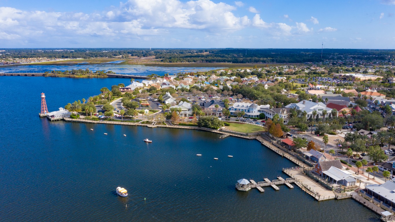
Physician counts measure supply, not access. Whether a cardiologist is accepting new Medicare patients, or how long the wait runs, appears in no ranking. In our own list, Sumter County, Florida, home of The Villages, had 57.6% of residents 65 or older but 39.8 primary care physicians per 100,000, against 72.5 statewide.
Median home value describes existing housing stock but says nothing about insurance. Arizona, Texas, North Carolina, Oregon, Illinois, and Utah had the largest approved rate increases, ranging from 20% to 30%. Tax rankings miss the newcomer’s position. Florida’s Save Our Homes rule limits homestead assessment growth to 3%, or the change in CPI, whichever is lower, but a sold property is reassessed at the full market value the following year. A buyer can owe far more than a longtime neighbor. Climate scores rely on averages, while extremes like heat waves and storm seasons weigh most on older residents.
Running a Ranked Town’s Numbers
The average household spent $78,535 in 2024. Adjusted by price parity, that comes to about $81,200 in Florida and $72,150 in Tennessee. Two retired workers drawing the SSA’s average $2,087.52 monthly benefit collect about $50,100 a year. That leaves gaps of roughly $31,100 and $22,050. At a 4% withdrawal rate, portfolio targets come to about $778,000 and $551,000. Every $5,000 in recurring costs a ranking missed, such as a reassessed tax bill or a wind policy, adds $125,000 to the target.
What No Index Captures, Including Its Own Effect
The reality is that paper lists can’t truly measure whether a 65-year-old newcomer can build a social life, what the place is like after seasonal residents leave, whether adult children will visit, or whether the neighborhood works. Those factors can shape whether a retiree stays. One Florida transplant said, “This move to Florida changed my life for the better.” Whether a move works depends on the place and the person.
Rankings also describe places as they stand today, but not a year or five years from now. A town that tops enough lists draws enough newcomers to push up housing costs and strain clinic capacity, earning it the ranking. Sumter County’s physician ratio fits that pattern, though broad evidence across destinations is thin.
Using a List to Narrow the Field
For most people, lists should work as a first filter, cutting a country down to three or four candidates. To decide, rent in the leading town for a full year, including its worst season. Confirm specialists for any existing conditions accept new Medicare patients. Get an insurance quote for a specific address and ask the county what property tax will be after a sale.
For a typical couple on average Social Security, the target falls between roughly $551,000 and $778,000 at 4%, plus a reserve for insurance and review (we made the full case for rethinking that 4% figure, and what to run in its place, in a free report here). A list will not only narrow the field, but living there for a year will decide the choice.
Contact [email protected] for any questions or corrections.
David Beren has been a Flywheel Publishing contributor since 2022. Writing for 24/7 Wall St. since 2023, David loves to write about topics of all shapes and sizes. As a technology expert, David focuses heavily on consumer electronics brands, automobiles, and general technology. He has previously written for LifeWire, formerly About.com. As a part-time freelance writer, David’s “day job” has been working on and leading social media for multiple Fortune 100 brands. David loves the flexibility of this field and its ability to reach customers exactly where they like to spend their time. Additionally, David previously published his own blog, TmoNews.com, which reached 3 million readers in its first year. In addition to freelance and social media work, David loves to spend time with his family and children and relive the glory days of video game consoles by playing any retro game console he can get his hands on.