
Humans have always communicated in visuals, from ancient cave drawings to marking a nation’s coins with symbols of that country. As commerce began, signs were used by businesses and guilds to identify them.
One of the earliest examples of corporate branding emerged as the result of the trade between the East and the West: The interlocking VOC logo of the Vereenigde Oost-Indische Companies, or Dutch East India Company. The company adorned its ships, flags, maps, and cannons with its logo, turning it into a potent symbol of colonial power and domination of East-West trading routes for nearly 190 years. Shell’s logo is one of the oldest corporate logos in the world.
Corporate logos really began to take off in the 19th century, along with the rapid ascent of industrialism, consumerism, and global trade. Companies that still use logos created in the late 1800s include Twinings Tea, Prudential, Levi Strauss & Co., and Heinz. Other logos, like the ones for Shell Oil and Ford Motor Company date back to the early years of their respective industries.
Today, company logos are everywhere, some with interesting features or colorful histories. The FedEx logo, for example, features an arrow that is cleverly hidden in plain sight, meant to symbolize the delivery company’s logistics speed and accuracy.
Other logos are, well, snooze-worthy. One can easily wonder the reasoning behind a company formed as a merger between automakers Fiat and Chrysler creating a mind-numbingly boring FCA logo, while at the same time retiring Chrysler’s iconic Pentastar logo.
The following are 20 well-known corporate logos and their meanings and back stories. These are all well-known major corporate brands in the United States, although not all are American. Many the companies behind these brands are among the largest employers in the United States.
Click here to see the stories behind America’s corporate logos
Methodology
24/7 Wall St. reviewed the current version of some of the most recognizable logos of the country’s largest companies. Researching logo histories — how they were conceived and evolved over the years — it became clear that many iconic American brand symbols bear an explanation that would surprise many consumers. These are some of the most interesting stories behind America’s corporate logos.

1. Amazon
Amazon.com’s logo went through three iterations in the company’s 24-year history, starting with variations of a capital “A” icon featuring a curvy profile of a river, a nod to the company’s namesake. Jeff Bezos had settled on the name because it included the letters “a” and “z” to represent the wide range of books offered on the platform. Eventually, the “A” icon was scrapped, and the company experimented briefly with different typesets of “Amazon.com.” Later, the company hired creative agency Turner Duckworth to create Amazon’s versatile logo, with its whimsical smile-shaped arrow that connects the “a” with the “z.”
[in-text-ad]
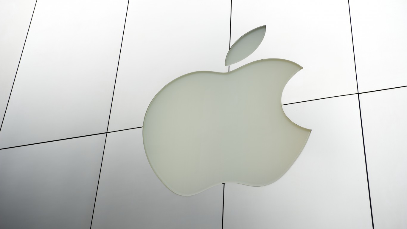
2. Apple
Apple’s logo looks significantly different than the hand-drawn original produced in the 1970s by company co-founder Ronald Wayne. Wayne was inspired by the (fictional) story of an apple falling on Isaac Newton’s head that gave the 17th century scientist his “eureka!” moment regarding the theory of gravity. The logo was short-lived because co-founder Steve Jobs reportedly found it to be too old fashioned for a forward-thinking computer company. But Wayne’s idea of using Newton’s apple as a symbol of science and innovation was so fitting that the simple Apple icon has endured for more than 40 years.
[recirclink id=538500]
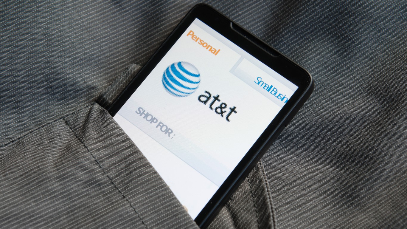
3. AT&T
For nearly a century, AT&T used a bell in its logo as a homage to its founder, Alexander Graham Bell. The Scottish-born telephone inventor founded in 1877 the Bell Telephone Company, which later became AT&T. After AT&T settled in 1982 with the U.S. Department of Justice to break up its local phone service monopoly, the company scrapped the bell icon to better reflect its pivot to global long distance services. Since 1983, AT&T has used different iterations of its banded globe logo to reflect its global reach, a logo that continues to work well in the era of broadband internet.

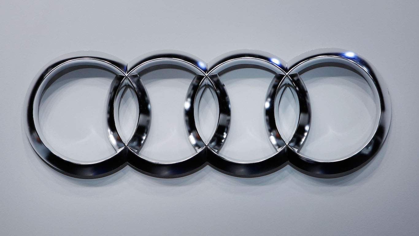
4. Audi
Audi’s logo has been four interlocking circles since 1932, after the company that was founded in 1909 absorbed three other automakers — Horch, DKW, and Wanderer. Each ring represents one of the companies. Horch was named after renowned German auto engineer August Horch, who founded Audi after leaving his namesake company. Audi has been part of Volkswagen Group since the 1960s.
[in-text-ad-2]
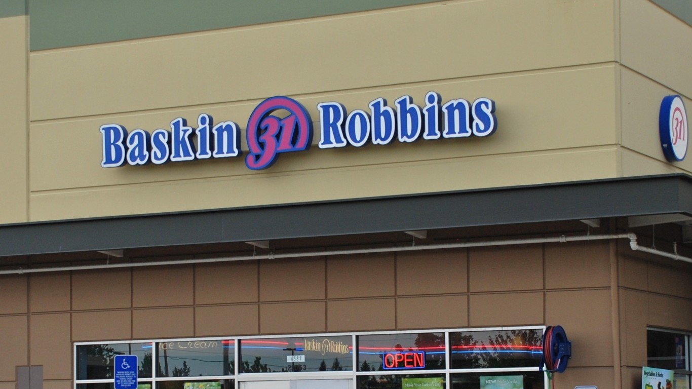
5. Baskin-Robbins
The U.S.-based global chain has been dishing out icy treats for more than 60 years. Since 1953, the company has used its “31 flavors” identity to signify its diverse selection of ice cream flavors — one for every day of the month. The “31” trademark and candy-color palate has endured through the decades. In 2007, the company overhauled its brand, but preserved the “31” number by incorporating it into the “B” and “R” of the new logo. Baskin-Robbins and its much larger Dunkin’ sibling company are both owned by Dunkin Brands, which has been working to bring the two stores together under one roof.

6. Bluetooth
The Bluetooth symbol may not be a company logo, but it may be the only globally recognizable trademarked logo for a technology standard. Found on virtually every modern wireless device, the logo is a combination of two ancient Danish runes of the letters “H” and “B,” the initials of Harald “Bluetooth” Gormsson, a 10th century Danish King who united Denmark and Norway. The nickname is believed to refer to descriptions of the king’s dead tooth. Intel engineer Jim Kardach, who was reading a book about the Vikings while working on the wireless technology standard with several other companies, including Ericsson and Nokia, suggested the name.
[in-text-ad]

7. BMW
If you are one of those people who thinks BMW’s iconic circular represents the spinning blades of an airplane propeller set against a blue sky background, you are forgiven. For years, the company fostered that misconception. The world’s largest luxury car maker (Bayerische Motoren Werke, or Bavarian Motor Works) had built aircraft engines early in its history, and in 1929, and the company’s ad campaign superimposed the logo over an airplane. As recently as 2010, a company spokesman admitted the logo, which was created in 1917, actually alludes to the colors of Bavaria, the state in Germany where BMW was founded.
[recirclink id=517010]
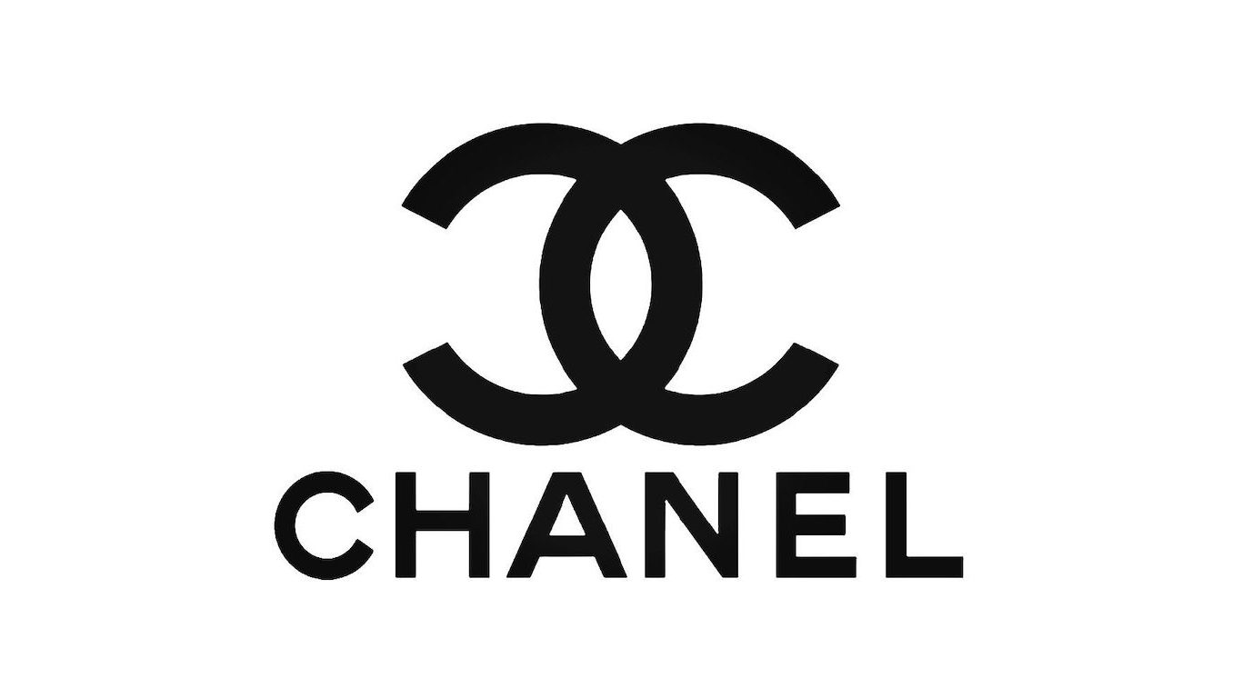
8. Chanel
The simplest explanation for the origin of one of the most recognizable logos in fashion is that the two interlocking “C” letters of the Chanel brand depicts the initials of its founder, Gabrielle Bonheur “Coco” Chanel, an orphan who got her start selling hats in Paris in 1910. But since there is no known official origin story, others have speculated the logo refers to a symbol used by French Queen Claude in the 16th century, or the patterns in the stained glass windows of the monastery where Chanel spent her childhood, or even to Chanel’s business partner and lover, Arthur “Boy” Capel.
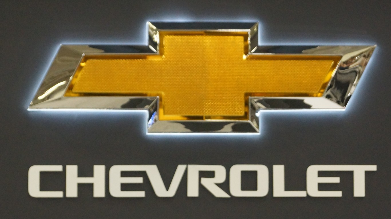
9. Chevrolet
Sometimes it’s not easy to find the complete origin story of a company logo. General Motors knows who created its enduring Chevrolet bowtie logo and when — company co-founder William C. Durant in 1913 — but the inspiration for the design is lost to history. The prevailing theory is that Durant was inspired by a wallpaper pattern in a French hotel, but other theories include that Durant was inspired by a similar pattern he saw while on vacation in Virginia in 1912, or that Durant created a stylized version of the Swiss flag as a nod to Louis Chevrolet’s Swiss birthplace.
[in-text-ad-2]
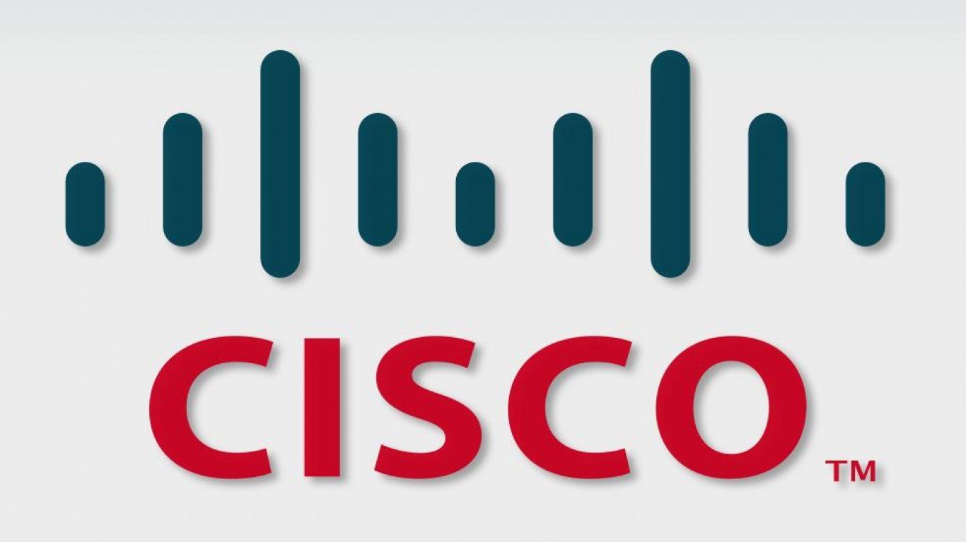
10. Cisco Systems
One of the world’s largest designers and makers of networking equipment derives its name from the city where it was established, San Francisco, in 1984. For its first 12 years, Cisco Systems utilized a fairly accurate representation of the Golden Gate Bridge, including the structure’s vertical support cables. Since then, the logo has changed three times, initially keeping the bridge’s general shape but stylizing the vertical cables to look more like electronic signal bars. Since 2006, however, Cisco’s logo has been more of an abstract representation of the bridge, so much so that it barely resembles the bridge at all.
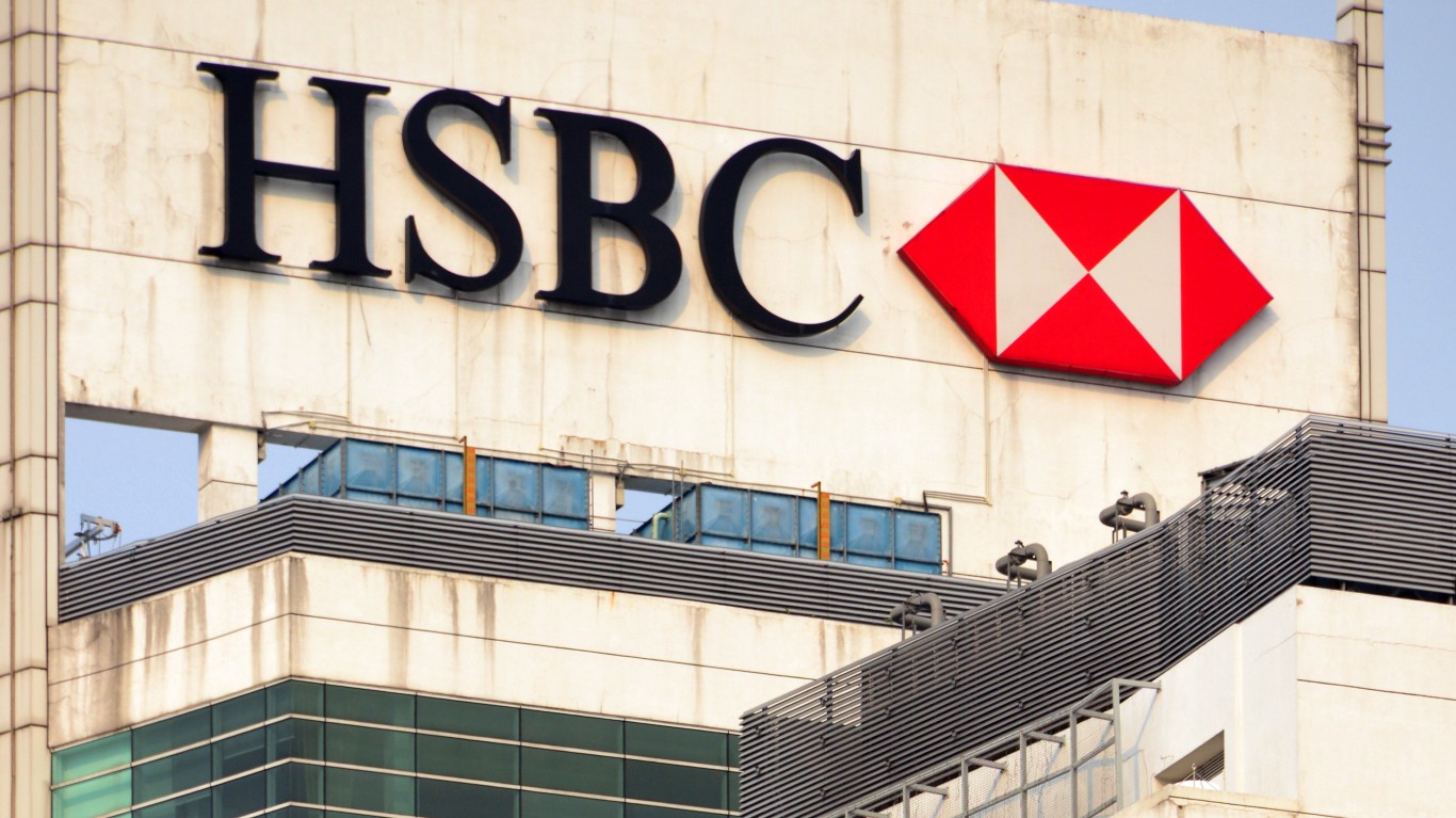
11. HSBC
This major British bank was established in 1991 as a holding company of the Hongkong and Shanghai Banking Corp., a bank with roots in China and Hong Kong dating back to 1865. HSBC’s hexagon logo, designed by Austrian graphic artist Henry Steiner, was introduced in 1983 as a stylized version of the bank’s corporate flag. The company’s 19th century house flag was itself inspired by the Cross of St. Andrew as recognition of bank’s original colonial British roots.
[in-text-ad]
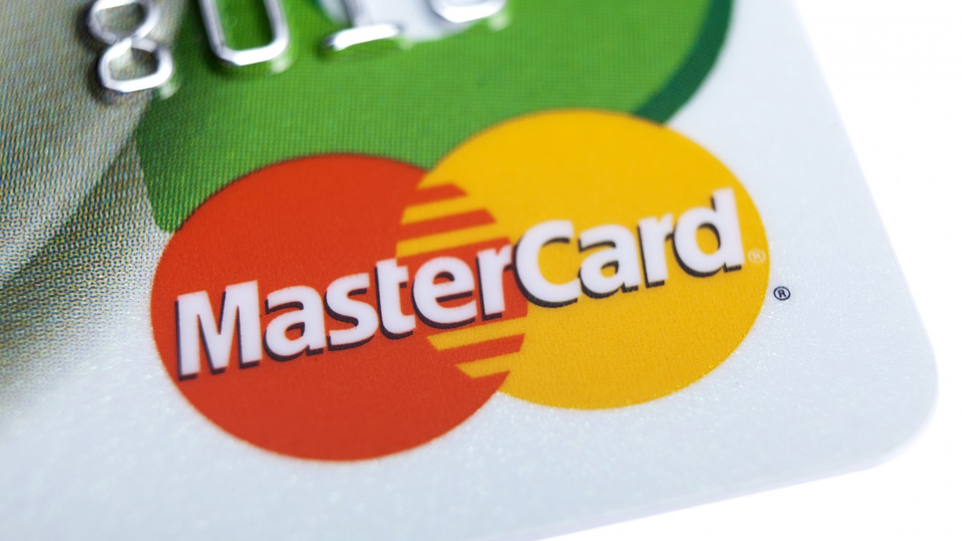
12. Mastercard
Mastercard’s logo of interlocking circles that appears on store windows and card readers the world over originated in the 1960s, about 20 years after banking services emerged that would evolve into the modern global credit card payment systems. The two-circle logo first appeared in 1969, after Japanese financial services providers joined what was then called Master Charge. The circles symbolize this partnership between East and West.
[recirclink id=538298]

13. Mercedes Benz
The origin of the Mercedes Benz logo pre-dates the 1926 merger of Mercedes maker Daimler Motor Corporation and Benz & Cie. Both carmakers registered their circular logos in 1909. Benz’s logo included the laurel wreath, while Daimler’s included the three-point star, which encompassed Gottlieb’s trilateral vision of water, air, and land motorization. The logos merged to include the wreath, the star, and the words “Mercedes” and “Benz.” The logo was simplified over the decades to become the circle and three-point star it is today.
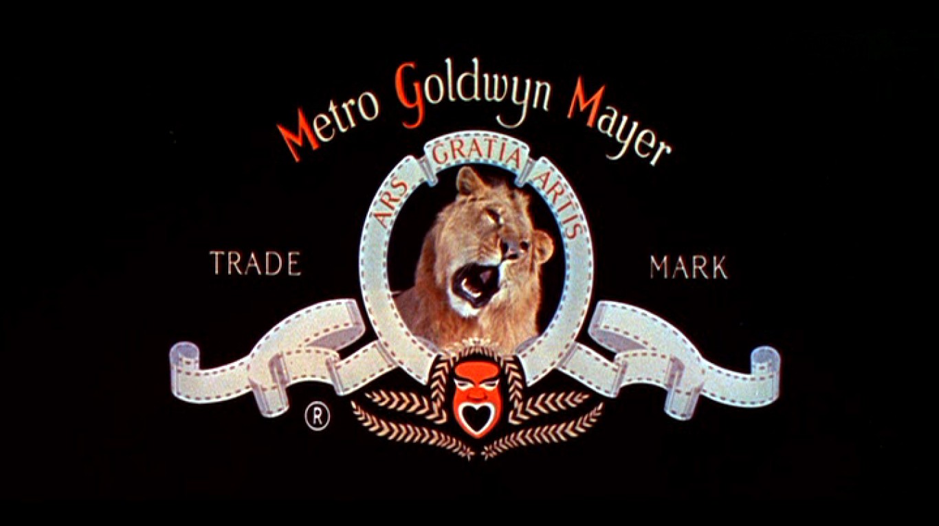
14. MGM
It might look antiquated, but that’s the point. Metro-Goldwyn-Mayer, the media company more commonly known as MGM, has kept its roaring Leo the lion logo virtually unchanged since 1957. And even before the mid-century re-design, the MGM logo featuring a roaring lion surrounded by a wreath of unspooled celluloid film has been pretty much the same since the company was founded in 1924. The one major difference is that the original MGM logo features a lion named Slats who doesn’t roar in the live footage. Several lions have been used in the MGM logo, but Leo remains the longest-serving MGM lion, the one you see today.
[in-text-ad-2]

15. Mitsubishi
This Japanese industrial conglomerate has been around since 1870. The name derives from the Japanese word “mitsu” (three) and “hishi” (water chestnut), which has long been used to denote a diamond shape that’s similar to the leaves of the plant. The founder of the company, Yataro Iwasaki, chose to merge his family crest of three stacked rhombuses with the three-leaf crest of the Tosa Clan that first employed him. The company later added the “Mitsubishi” text below the triangle to clarify the symbol for modern times.
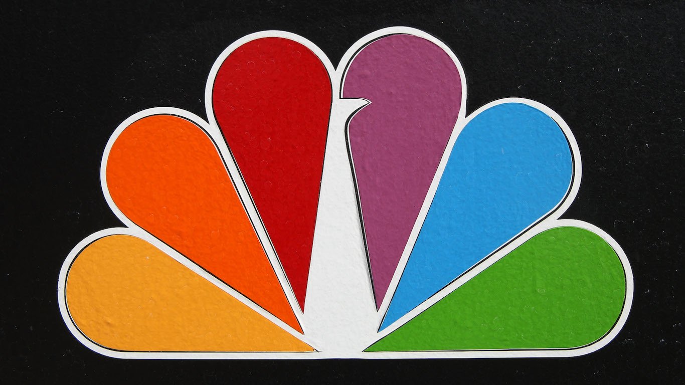
16. NBC
One of the most recognizable logos in television history is a callback to the shift from black and white to color television broadcasting. The first peacock logo appeared in 1956 as a way to promote the network’s colorcast programming. The colorful bird was retired in 1975 as part of a short-lived rebranding effort. It was brought back in 1980, and in 1986, the logo was redesigned and simplified; the number of feathers was dropped from 11 to 6, each representing one of NBC’s six divisions at the time: the network itself, news, sports, entertainment, TV stations, and operations and technical services.
[in-text-ad]
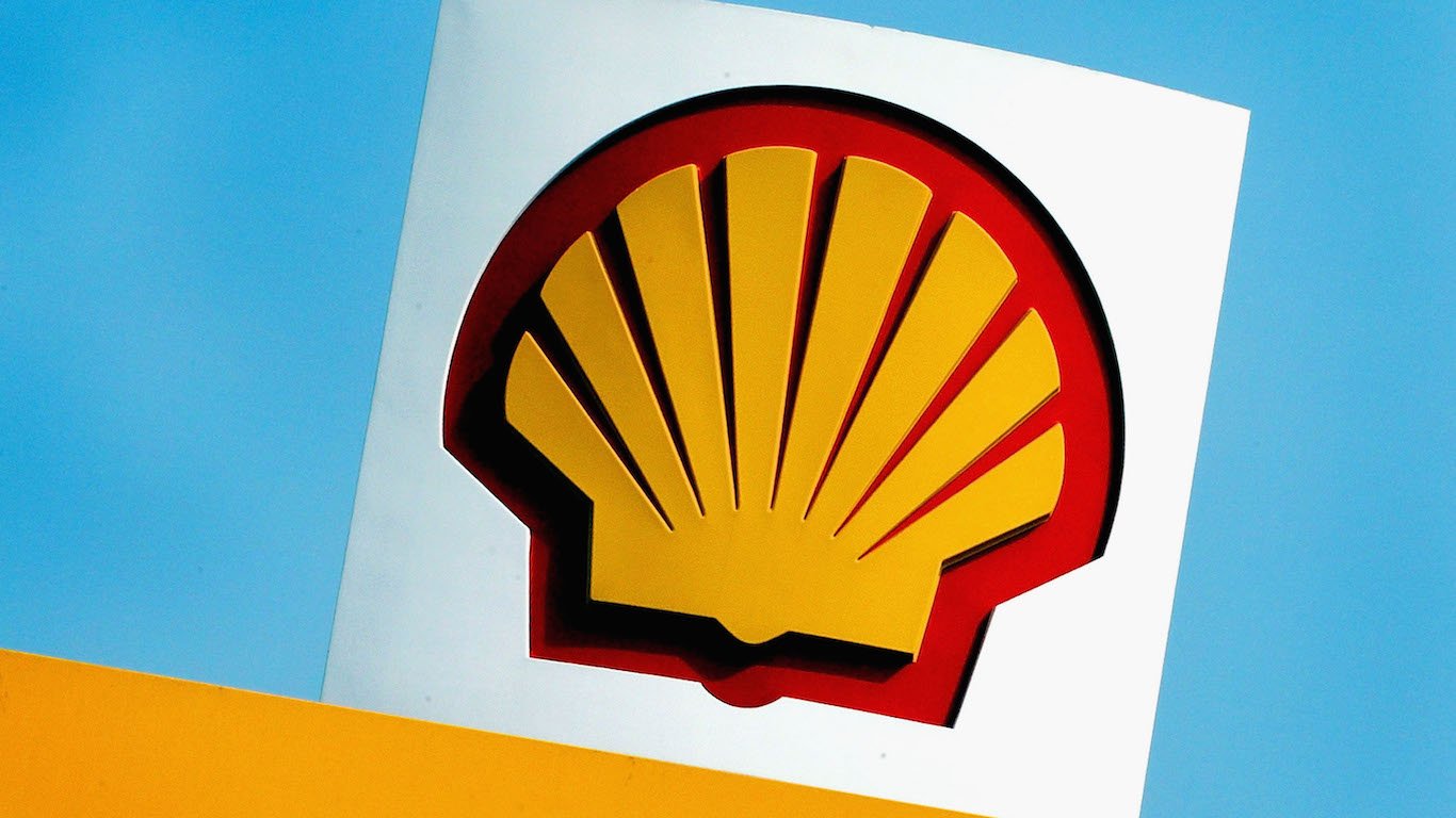
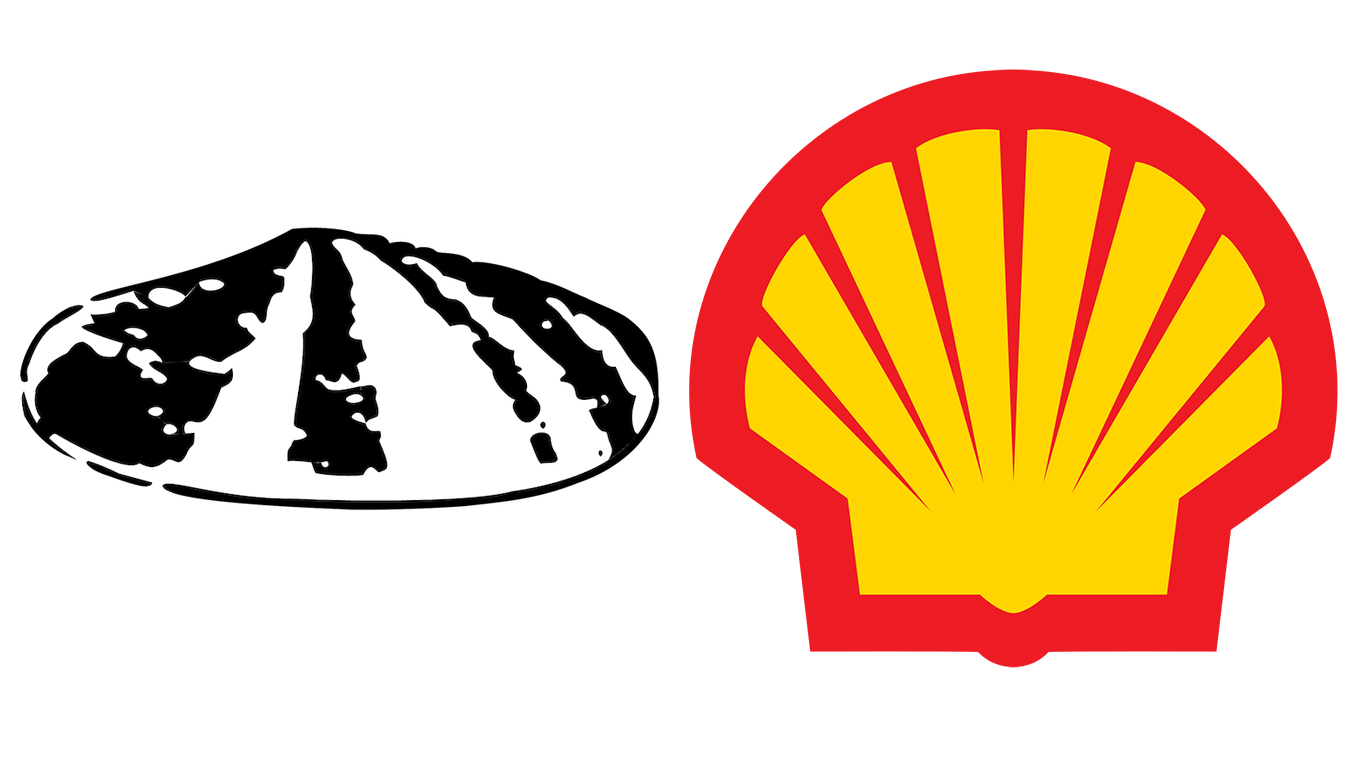
17. Shell
The British-Dutch oil and gas company’s logo is a throwback to the company’s roots as a small London-based antiques and curios broker that rode a Victorian-era trend of using seashells as decorations on consumer items like trinket boxes. The demand for seashells helped grow the company’s kerosene-based import-export business, and the first scallop shell logo, depicted as lying flat and colorless, was introduced in 1900. It has gone through nine revisions since. By 1930, the logo depicted the upright yellow shell, and in 1948 the word “Shell” appeared as part of the logo. In 1992, the word was removed.
[recirclink id=538012]
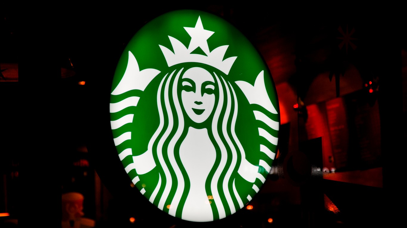
18. Starbucks
In 1971, Starbucks was a small Seattle coffee shop whose founders settled on a logo reflecting the seafaring tradition of early coffee merchants. “The Siren” logo was originally a brown image of a topless double-tailed mermaid based on a 16th century Norse woodcut. But as the company expanded, the image proved to be too racy. By 1987, the logo began to resemble the more family friendly version of what you see today. Since 2011, all text has been removed from the logo, and the Siren was modified to add almost imperceptible asymmetries to making the Siren appear more human.
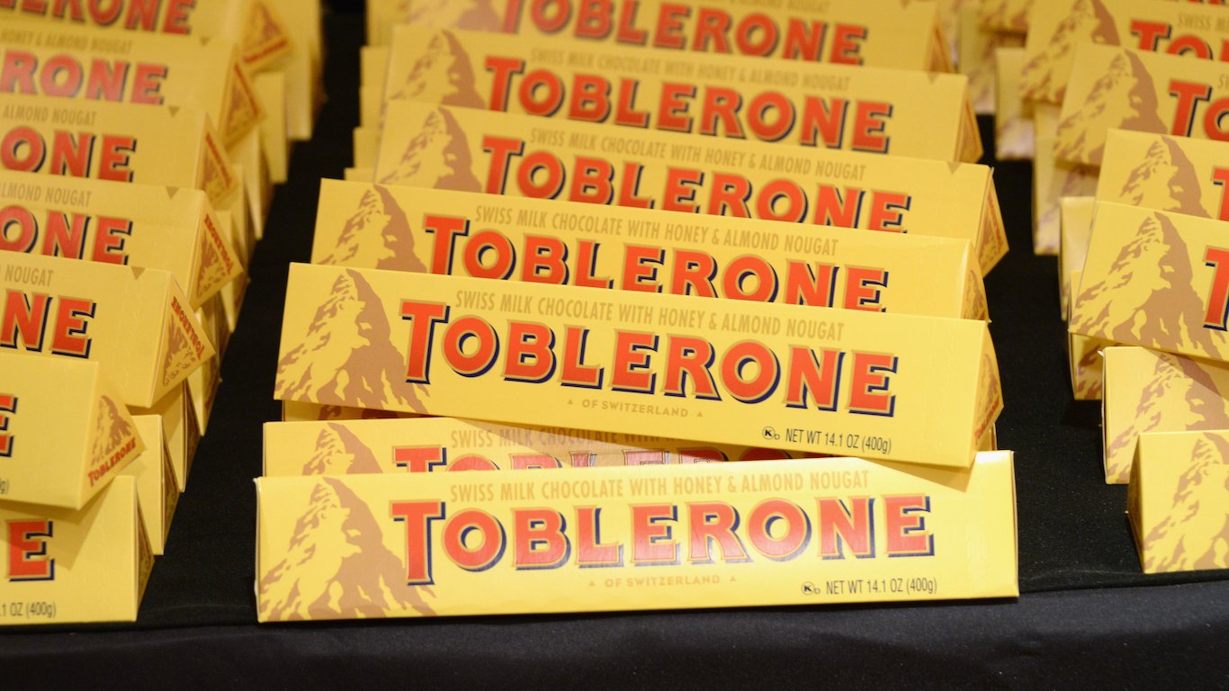
19. Toblerone
The popular chocolate bar has its origins in late 19th century Bern, Germany, produced by the Tobler family of chocolatiers. According to legend, the chocolate bar’s distinct easy-to-break triangle shapes were inspired by the shape of Switzerland’s Matterhorn mountain peak that adorns the candy’s packaging. Whether that’s true or not is up for debate, but what isn’t are the characteristics of the logo that pay homage to Bern. One is the bear hidden in the mountain peak, a reference to the city’s coat of arms.
[in-text-ad-2]
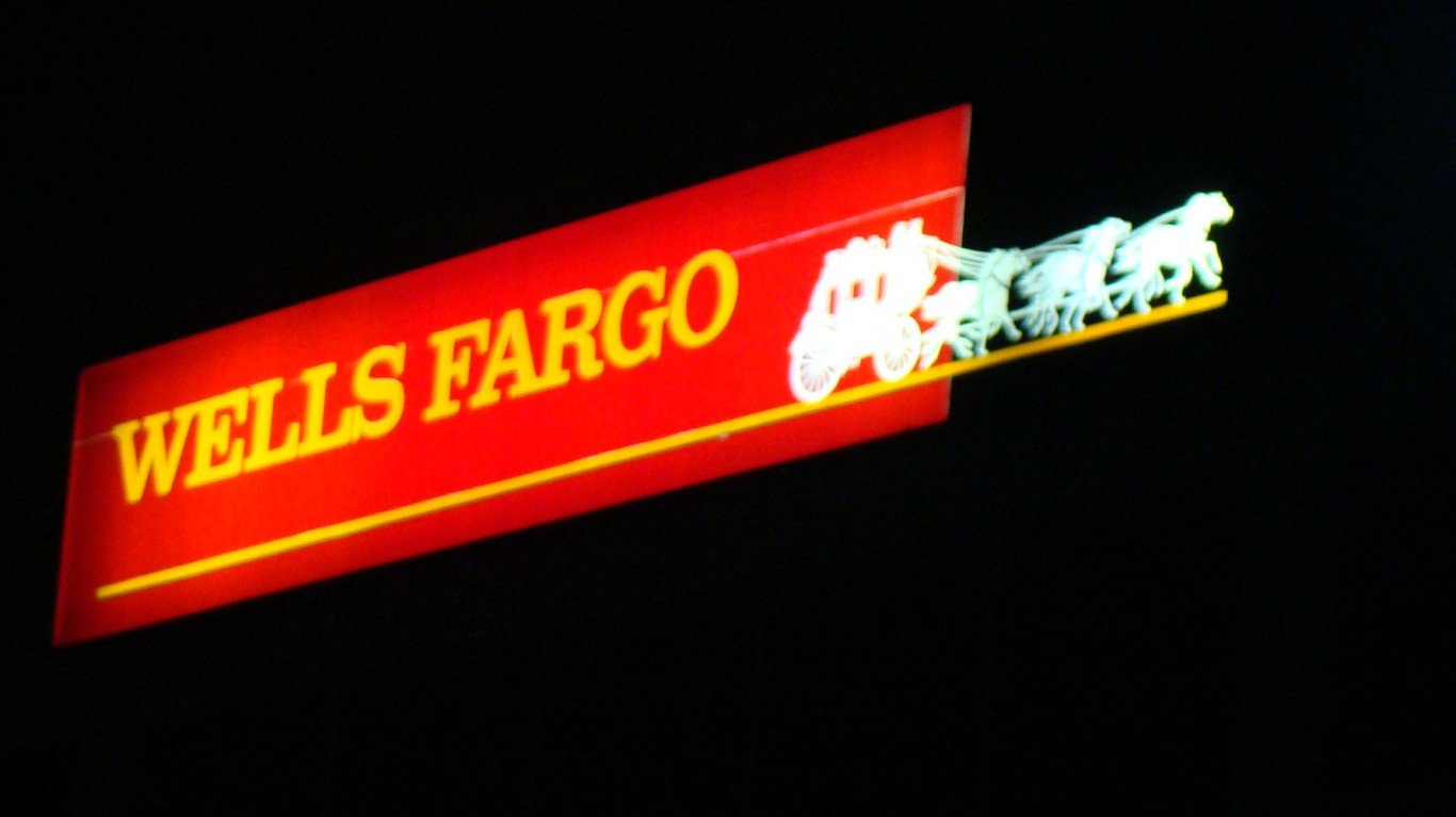
20. Wells Fargo
Today, Wells Fargo is a bank, but way back in the mid 1800s, Wells Fargo was a leading provider of bulk mail transportation across the Great Plains and Rockies, serving the growing population of Americans out in the West. The bank still uses the coach logo as homage to its past.
Contact [email protected] for any questions or corrections.