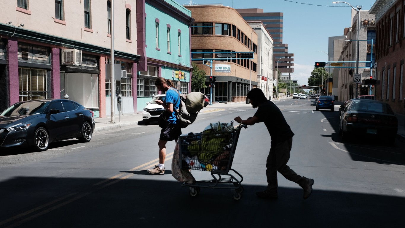


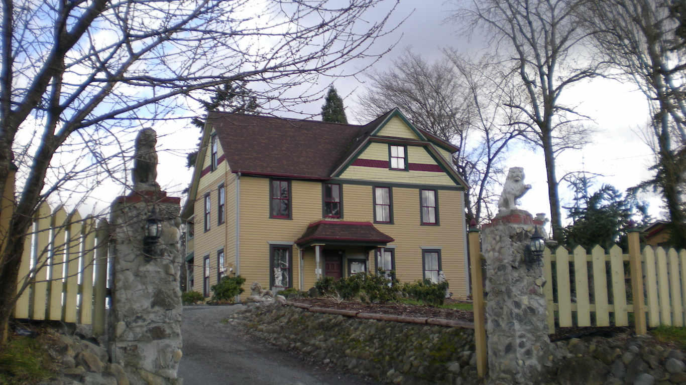
The United States attracts more immigrants than any other country in the world. America’s appeal to new residents is testimony that many still view the U.S. as the land of opportunity — a place where people have the chance to successfully pursue a happy, safe, and fulfilling life. However, some parts of the country do not fit this description.
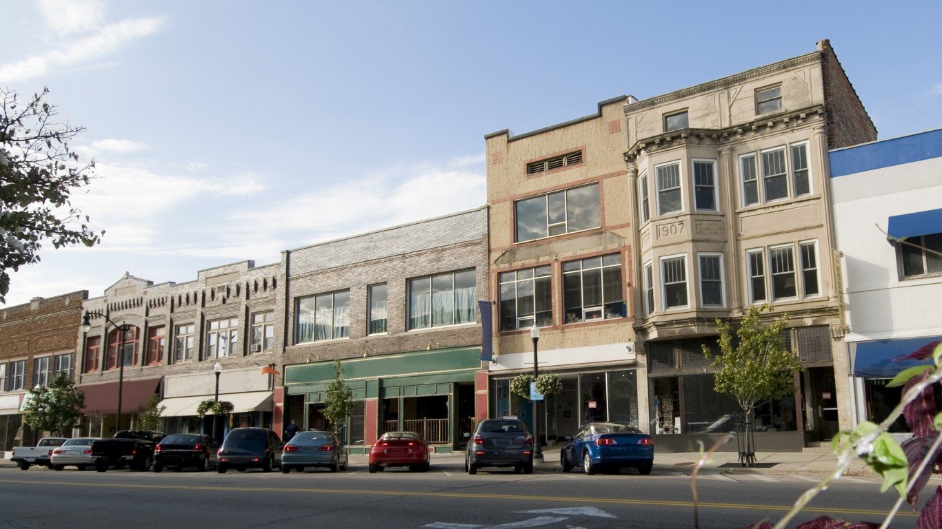
In nearly every state, there are cities and towns that are grappling with severe social and economic distress. These communities struggle with challenges such as high unemployment, poverty, crime, drug abuse, and limited access to essential services — in stark contrast with the best cities to live in in every state.
Using data from a range of sources, including the FBI, Centers for Disease Control and Prevention, and the U.S. Census Bureau, 24/7 Wall St. created a weighted index of 25 social, economic, and health measures to identify the worst place to live in in every state. We considered cities, towns, villages, and Census designated places.
It is important to note that the cities on this list rank poorly compared to other places within their respective state and do not necessarily rank poorly on a national level. In some states with smaller populations, variations in measures of quality of life between cities and towns are often less pronounced. In these states, the community that ranks as the worst place to live often does not face many of the serious social and economic problems common in other cities on this list.
Undesirable living conditions in many of the places on this list are likely contributing to population decline. The vast majority of these communities are home to fewer people now than five years ago. Here is a list of the cities that Americans are abandoning.
Click here to see the worst cities to live in every state:
Click here to see our methodology:

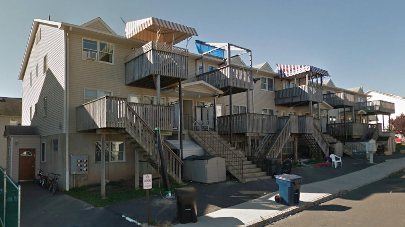
Alabama: Selma
> Population: 18,804
> Median home value: $90,200 (state: $137,200)
> Poverty rate: 41.0% (state: 17.5%)
> 5 yr. avg. unemployment: 15.7% (state: 6.6%)
With limited economic opportunities and widespread poverty, Selma — a city that played a historic role in the American civil rights movement — ranks as the worst place to live in Alabama. Over the last five years, an average of 15.7% of the local labor force has been unemployed, well above the 6.6% state jobless rate over that time. With a poverty rate of 41.0%, Selma residents are more than twice as likely to live below the poverty line as the typical Alabama resident.
As is often the case in economically distressed areas, Selma’s population is shrinking rapidly. Over the last five years, the number of people living in the city fell by 7.8%.
[in-text-ad]

Alaska: Kalifornsky
> Population: 8,134
> Median home value: $247,000 (state: $265,200)
> Poverty rate: 11.6% (state: 10.8%)
> 5 yr. avg. unemployment: 7.2% (state: 7.4%)
Kalifornsky, a coastal Census designated place in southern Alaska, ranks as the worst place to live in the state. It is located in the Kenai Peninsula Borough, which has about 24 fatal drug overdoses for every 100,000 people annually, the second highest drug overdose rate of any borough or county equivalent in Alaska. Additionally, the poverty rate in Kalifornsky of 11.6% is slightly higher than the 10.8% statewide poverty rate.
Like many cities, towns, and equivalent places on this list, people are leaving Kalifornsky faster than they are coming in. Over the last half decade, the number of people living there has fallen by 3.2%.
[recirclink id=729078]
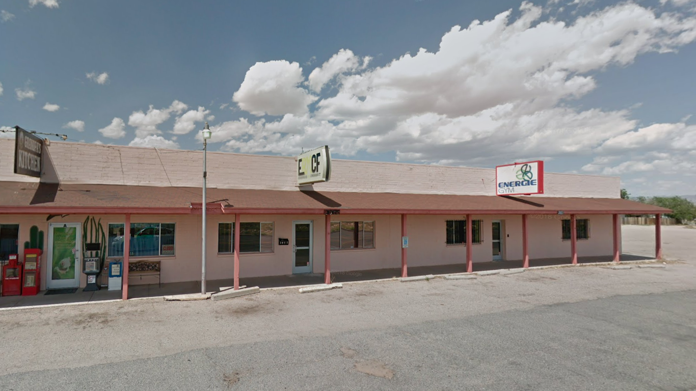
Arizona: New Kingman-Butler
> Population: 13,471
> Median home value: $62,600 (state: $209,600)
> Poverty rate: 28.0% (state: 16.1%)
> 5 yr. avg. unemployment: 15.9% (state: 6.5%)
New Kingman-Butler, a Census designated place in western Arizona, ranks as the worst place to live in the state, largely due to widespread economic hardship. The local poverty rate stands at 28.0% — well above the 16.1% statewide rate. The area’s low incomes and high poverty are likely related in part to the weak job market. The average unemployment rate in the area over the last five years was 15.9%, more than double the 6.5% state rate over that time.
Property values can be indicative of an area’s desirability as a place to live. In New Kingman-Butler, most homes are worth less than $65,000. Meanwhile, most homes in Arizona are worth well more than $200,000.
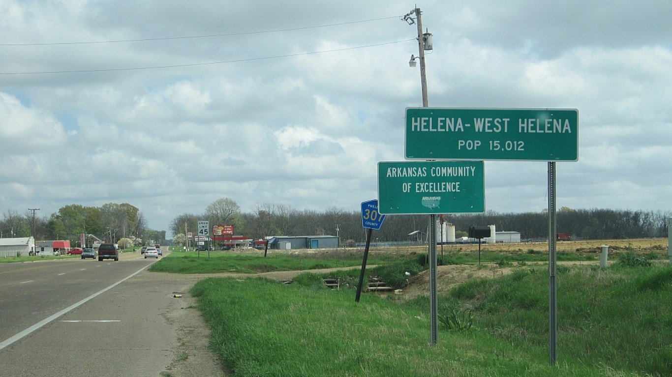
Arkansas: Helena-West Helena
> Population: 10,965
> Median home value: $75,600 (state: $123,300)
> Poverty rate: 41.7% (state: 17.6%)
> 5 yr. avg. unemployment: 12.2% (state: 5.5%)
Helena-West Helena, a city in eastern Arkansas, is one of the poorest places in the United States. The typical household in the metro area earns $22,400 a year, about a third of the income the typical American household earns, and even well below the state’s relatively low $48,726 median household income. Additionally, the city’s 41.7% poverty rate is more than double the 17.6% poverty rate across all of Arkansas.
The once thriving city was hit hard by the closing of the Mohawk Rubber Company in the 1970s. The average unemployment rate over the last five years was 12.2% in the city. Over the same period, the number of people living there has fallen by 8.7%.
[in-text-ad-2]
California: Muscoy
> Population: 13,726
> Median home value: $236,800 (state: $475,900)
> Poverty rate: 38.1% (state: 14.3%)
> 5 yr. avg. unemployment: 17.8% (state: 6.7%)
Muscoy is a Census designated place in southern California located just north of San Bernardino. The area was originally developed for agricultural enterprises in the 1920s and experienced a population boom following World War II, which led to its transition to a suburban area that depended largely on tourism from Route 66 travelers.
Now one of the poorest places in the state, Muscoy’s poverty rate of 38.1% is more than double the California poverty rate of 14.3%. Widespread financial hardship and limited economic opportunities often go hand in hand, and in Muscoy, the five-year average unemployment rate is a staggering 17.8%.

Colorado: Clifton
> Population: 20,572
> Median home value: $138,100 (state: $313,600)
> Poverty rate: 25.6% (state: 10.9%)
> 5 yr. avg. unemployment: 11.0% (state: 4.7%)
Clifton is a suburb of Grand Junction, Colorado, located in the western part of the state. A relatively poor area, Clifton has a median annual household income of about $42,000, and nearly one in every 10 area households lives on less than $10,000 a year. The area’s low incomes are likely partially related to a lack of jobs, as the average unemployment over the last five years stands at 11.0%. Over the same period, the number of people living in Clifton declined by 1.8%.
[in-text-ad]
Connecticut: Thompsonville
> Population: 8,439
> Median home value: $173,500 (state: $272,700)
> Poverty rate: 25.5% (state: 10.0%)
> 5 yr. avg. unemployment: 9.3% (state: 6.5%)
Thompsonville, Connecticut, is located just south of Springfield, Massachusetts. Over the last five years, employment in the area has fallen by 8.0%, and the average jobless rate over the same period was 9.3%, well above the 6.5% state unemployment rate over that time.
Parts of New England have been hit especially hard by the opioid epidemic. Across Hartford County, where Thompsonville is located, there have been 34 drug overdose deaths for every 100,000 people annually, above the comparable overdose rate of 30 per 100,000 statewide. Real estate prices can be indicative of how desirable an area is, and in Thompsonville, the typical home is worth about $100,000 less than the typical Connecticut home.
[recirclink id=724713]

Delaware: Wilmington
> Population: 70,904
> Median home value: $169,400 (state: $244,700)
> Poverty rate: 25.1% (state: 11.9%)
> 5 yr. avg. unemployment: 8.4% (state: 5.9%)
Wilmington, the largest city in Delaware, also ranks as the worst place to live in the state. A relatively poor city, Wilmington is one of only a dozen cities in Delaware where more than one in every 10 households earn less than $10,000 a year. Additionally, it is one of only half a dozen cities and towns in the state where more than one in every four residents live below the poverty line.
Lower-income areas often have higher crime rates, and Willmington is one of the most dangerous cities in Delaware. There were 1,545 violent crimes reported in the city for every 100,000 residents, more than triple the violent crime rate across the state as a whole of 424 offenses per 100,000 people.
Florida: Avon Park
> Population: 10,386
> Median home value: $68,400 (state: $196,800)
> Poverty rate: 33.0% (state: 14.8%)
> 5 yr. avg. unemployment: 19.9% (state: 6.3%)
Avon Park, a small central-Florida city, ranks as the worst place to live in the state. Over the last five years, an average of about one in every five members of the labor force in the area were unemployed — more than three times the statewide jobless rate over that time. With a weak job market, many in the city are struggling financially. The median annual household income in Avon Park is just $30,675, about half as much as the median household income nationwide. Additionally, Avon Park’s poverty rate of 33.0% is more than double the 14.8% statewide rate.
[in-text-ad-2]
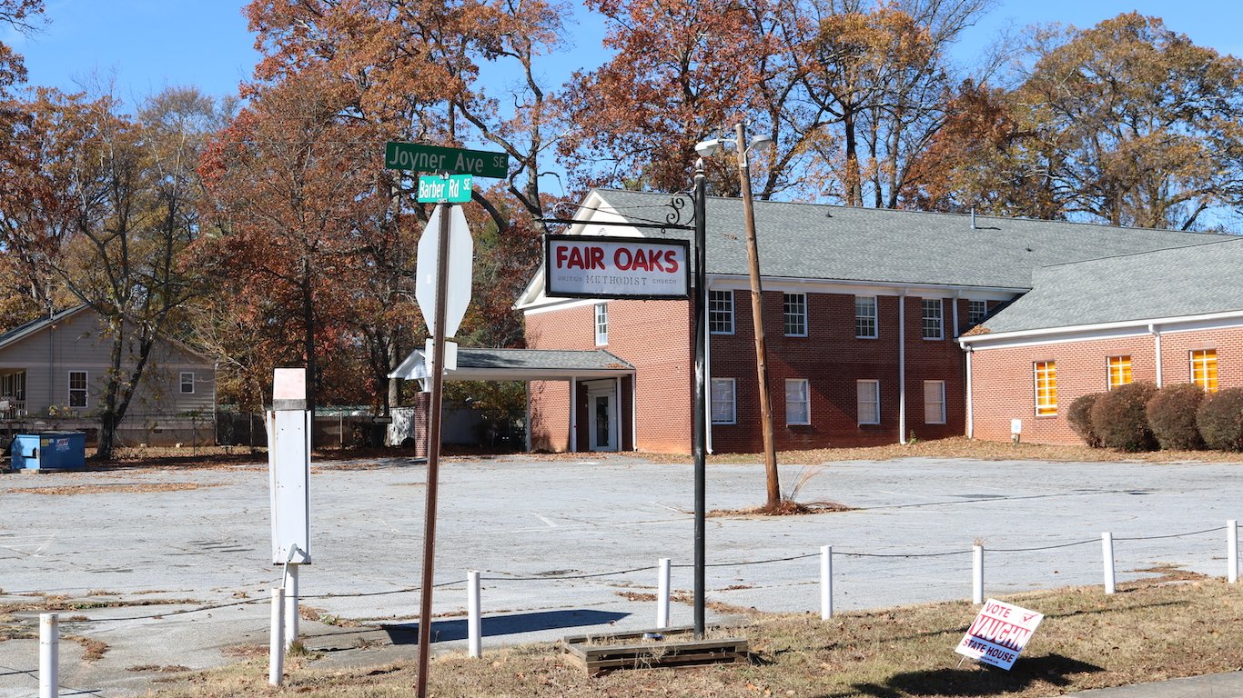
Georgia: Fair Oaks
> Population: 9,173
> Median home value: $100,900 (state: $166,800)
> Poverty rate: 32.6% (state: 16.0%)
> 5 yr. avg. unemployment: 8.1% (state: 6.4%)
Fair Oaks, Georgia, is located about 20 miles northwest of downtown Atlanta. Nearly one-third of all Fair Oaks residents live below the poverty line, about double the 16.0% statewide poverty rate. Incomes tend to rise with educational attainment, and educational attainment rates are low in Fair Oaks. Fewer than two in every three adults in the area have completed high school, and more than one in every 10 have a bachelor’s degree.
As is the case in many places on this list, people are leaving Fair Oaks faster than they are coming in. Over the last half decade, the community’s population contracted by 1.1%.

Hawaii: Makaha
> Population: 8,740
> Median home value: $383,200 (state: $587,700)
> Poverty rate: 28.0% (state: 9.9%)
> 5 yr. avg. unemployment: 16.7% (state: 4.5%)
Makaha is a small Census designated place on Oahu’s west shore, just northwest of Honolulu. Though there are several local beaches, there are not many employment opportunities. Over the last five years, the jobless rate in Makaha has averaged 16.7%, more than triple the 4.5% comparable statewide average. With a weak job market, local residents are more likely to struggle financially. The poverty rate in Makaha is 28.0%, nearly three times the 9.9% poverty rate statewide.
[in-text-ad]
Idaho: Blackfoot
> Population: 11,854
> Median home value: $124,100 (state: $192,300)
> Poverty rate: 15.4% (state: 13.8%)
> 5 yr. avg. unemployment: 1.9% (state: 4.7%)
Variation in overall quality across Idaho is not as stark as it is in much of the country. Partially as a result, even though it ranks as the worst place to live in the state, Blackfoot is not grappling with many of the serious social and economic problems other cities on this list.
One of the reasons Blackfoot ranks on this list is food insecurity. Nearly three in every four people in the city and surrounding county live in urban areas that are at least 1 mile from a grocery store or in rural areas that are at least 10 miles from from a grocery store. Incomes in Blackfoot are also lower than average. The median household income is just $42,606 a year, about $11,000 less than the median in the state.
[recirclink id=724802]
Illinois: East St. Louis
> Population: 26,647
> Median home value: $52,200 (state: $187,200)
> Poverty rate: 37.8% (state: 13.1%)
> 5 yr. avg. unemployment: 17.4% (state: 6.6%)
East St. Louis is a small city in western Illinois, directly across the Mississippi River from St. Louis, Missouri. Like its neighbor across the river, East St. Louis is a relatively dangerous city. There were 1,190 violent crimes reported in the city for every 100,000 residents compared to just 404 for every 100,000 people across Illinois.
Crime is often concentrated in lower-income areas, and in East St. Louis, many are struggling financially. The city’s poverty rate of 37.8% is nearly three times higher than the 13.1% statewide poverty rate. The area’s high crime rate is also likely depressing real estate values. Most homes in East St. Louis are worth less than $53,000, less than a third of the median home value of $187,200 across Illinois.
Indiana: East Chicago
> Population: 28,448
> Median home value: $73,900 (state: $135,400)
> Poverty rate: 32.5% (state: 14.1%)
> 5 yr. avg. unemployment: 12.3% (state: 5.4%)
Located in the northwest corner of Indiana, about 20 miles southeast of downtown Chicago, East Chicago has been suffering economically for years. City residents are more than twice as likely to be unemployed and almost twice as likely to live in poverty than the typical Indiana resident.
East Chicago and the surrounding area have also been hit harder than most of the country by the opioid epidemic. There were about 29 drug overdose deaths in Lake County — where East Chicago is located — for every 100,000 people annually. Across Illinois, the overdose death rate is 21 per 100,000 people.
[in-text-ad-2]

Iowa: Denison
> Population: 8,358
> Median home value: $90,700 (state: $142,300)
> Poverty rate: 16.0% (state: 11.7%)
> 5 yr. avg. unemployment: 10.7% (state: 3.9%)
Denison, a small city in western Iowa, ranks as the worst place to live in the state. While Iowa’s unemployment rate has remained relatively low in recent years, Denison’s has not. An average of 10.7% of the local labor force has been out of work in the last half decade, compared to the 3.9% comparable statewide average.
Americans with higher educational attainment are less likely to face joblessness than those with more limited formal education. In Denison, fewer than two in every three adults have a high school diploma.

Kansas: Junction City
> Population: 23,703
> Median home value: $138,700 (state: $145,400)
> Poverty rate: 12.0% (state: 12.4%)
> 5 yr. avg. unemployment: 6.8% (state: 4.4%)
The five-year average unemployment rate of 6.8% in Junction City, Kansas, is higher than the comparable 4.4% state average but not nearly as high as in many of the other cities and towns on this list. Still, jobs appear to be disappearing in the eastern Kansas city as over the last half decade, overall employment has fallen by 9.0%. Though the city’s poverty rate of 12.0% is slightly lower than the statewide rate of 12.4%, overall incomes are relatively low in the city. The typical area household earns $51,198 a year, about $6,000 less than the typical Kansas household.
As is often the case among the cities on this list, people are leaving Junction City faster than they are moving in. The city’s population contracted by 1.8% over the last five years.
[in-text-ad]
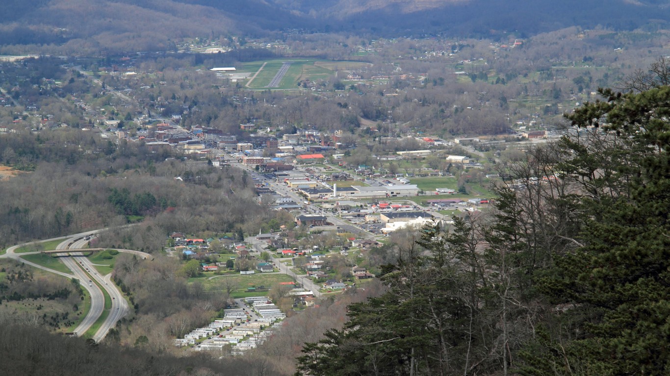
Kentucky: Middlesboro
> Population: 9,583
> Median home value: $88,000 (state: $135,300)
> Poverty rate: 40.6% (state: 17.9%)
> 5 yr. avg. unemployment: 8.1% (state: 6.1%)
Middlesboro, Kentucky, is one of the poorest places in the United States. Most households in the area earn less than $25,000 a year, and nearly one-quarter of households live on an income of less than $10,000 annually. Incomes tend to rise with educational attainment, and in Middlesboro, fewer than one in every 10 adults have a bachelor’s degree, about a third of the national bachelor’s degree attainment rate.
Many parts of the country with flagging economies are those hardest hit by the opioid epidemic. Across Bell County, where Middlesboro is located, there are 40 drug overdose deaths for every 100,000 people annually, above the state rate of 34 fatal overdoses for every 100,000 people.
[recirclink id=723793]
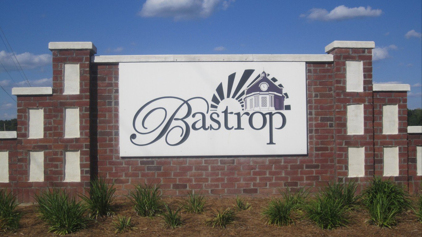
Louisiana: Bastrop
> Population: 10,521
> Median home value: $76,000 (state: $157,800)
> Poverty rate: 47.9% (state: 19.4%)
> 5 yr. avg. unemployment: 7.3% (state: 6.9%)
Bastrop, a small city in northeastern Louisiana, ranks as the worst place to live in the state. Nearly half of the local population lives on poverty level income, more than double the 19.4% state poverty rate, which itself is far higher than the 14.1% national poverty rate. Bastrop is also a relatively dangerous city. The city’s violent crime rate of 1,344 incidents per 100,000 people is more than triple the national rate of 381 per 100,000.
The area’s low incomes and high crime may be pushing many out of Bastrop. Over the last five years, the number of people living there fell by 6.2%. High crime and reduced demand for housing are likely driving down real estate values in the area. The typical home in Bastrop is worth just $76,000, less than half the median home value of $157,800 across Louisiana.

Maine: Bangor
> Population: 32,098
> Median home value: $150,700 (state: $184,500)
> Poverty rate: 22.5% (state: 12.5%)
> 5 yr. avg. unemployment: 6.6% (state: 4.6%)
Bangor is a relatively poor city in Maine. Most households in the city earn less than $43,000 a year, and one in every 10 households live on an income of less than $10,000 annually. Many low-income areas have been hit especially hard by the opioid epidemic. In Bangor, there are 37 drug deaths for every 100,000 people annually compared to 29 per 100,000 across the state as a whole.
Maine has been struggling with sluggish population growth in recent years. The number of people living in Bangor has fallen by 2.4% in the last half decade.
[in-text-ad-2]
Maryland: Lansdowne
> Population: 8,571
> Median home value: $151,100 (state: $305,500)
> Poverty rate: 27.9% (state: 9.4%)
> 5 yr. avg. unemployment: 10.1% (state: 5.6%)
Lansdowne, Maryland, is a small Census designated place located less than 10 miles south of Baltimore. Part of the reason Lansdowne ranks as the worst place to live in the state is the high concentration of violent crime in and around the community. Across Baltimore County, where Lansdowne is located, there were 583 violent crimes reported for every 100,000 people in 2018, making it the most dangerous county in the state.
In Lansdowne, residents are about twice as likely to be unemployed and three times more likely to live below the poverty line than the typical Maryland resident.
Massachusetts: Southbridge Town
> Population: 16,894
> Median home value: $193,500 (state: $366,800)
> Poverty rate: 19.2% (state: 10.8%)
> 5 yr. avg. unemployment: 8.1% (state: 5.4%)
Southbridge Town is one of a number of municipalities in Massachusetts that have kept the word Town in their names, despite cities. The city grew rapidly and thrived during the industrial revolution. Today, however, Southbridge Town is lagging behind much of the state in several socioeconomic measures.
Over the last five years, the unemployment rate in the city has been an average 8.1% — higher than the comparable 5.4% rate across Massachusetts. As is the case in much of the New England region, Southbridge Town and the surrounding area have also been hit hard by the opioid epidemic. The city is located in Worcester County, which has had about 35 fatal drug overdoses for every 100,000 people annually, in line with the comparable state rate, but far more than the national drug overdose rate of 22 per 100,000.
[in-text-ad]
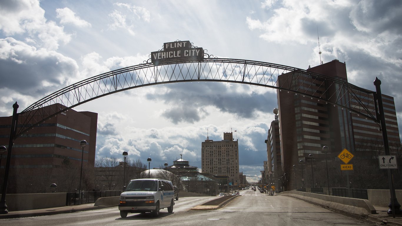
Michigan: Beecher
> Population: 9,128
> Median home value: $28,600 (state: $146,200)
> Poverty rate: 38.4% (state: 15.0%)
> 5 yr. avg. unemployment: 23.1% (state: 6.5%)
Beecher is a small Census designated place in Michigan, less than 10 miles north of Flint. The area is one of the most economically depressed in the country, with a five-year average unemployment rate of 23.1%. The lack of jobs means many residents face serious financial hardship. An estimated 38.4% of Beecher residents live in poverty, and about one in every five households earn less than $10,000 a year.
Economic problems likely exacerbate some social and health problems in the area. Across Genesee County, where Beecher is located, there are about 45 drug overdose deaths for every 100,000 people annually, the most of any county in the state.
[recirclink id=723248]
Minnesota: Cloquet
> Population: 11,998
> Median home value: $142,500 (state: $211,800)
> Poverty rate: 14.9% (state: 10.1%)
> 5 yr. avg. unemployment: 5.9% (state: 3.9%)
Cloquet, located in northeastern Minnesota, about 20 miles west of Duluth, ranks as the worst place to live in the state. The city was founded over a century ago, when it depended heavily on the logging industry. Today, the largest employers are paper and pulp mills and metal ore mining operations, and joblessness is not as much of a problem in the city as it is in the vast majority of cities on this list. Still, for those who are working, incomes are relatively low. The median household income in Cloquet is $51,410 a year, far less than the median income statewide of $68,411.
A largely rural community, Cloquet does not have as many places like restaurants, hotels, and gyms and fitness centers per capita as the country as a whole on average. Also, across the surrounding county, about three in every four residents live in areas with limited access to places for fresh food, like grocery stores.
Mississippi: Natchez
> Population: 15,188
> Median home value: $108,000 (state: $114,500)
> Poverty rate: 35.9% (state: 20.8%)
> 5 yr. avg. unemployment: 10.3% (state: 8.2%)
Natchez, a historic city in southwestern Mississippi, was originally established as French fort site in the early 1700s. When Mississippi first became a state in 1817, it served as its first capital. Today, the area depends largely on tourism, and many residents are struggling. More than one in every three people in the city live on poverty-level income, and about one in every 10 members of the labor force are unemployed. Over the last five years, the number of people working in Natchez has declined by 8.1%.
Housing is less affordable in Natchez than it is in much of the country. While the median home value in the area of $108,000 is lower than it is nationwide, it is over four times the area’s median annual household income of $26,288. Across Mississippi, the typical home is worth 2.6 times as much as the median household income.
[in-text-ad-2]
Missouri: Spanish Lake
> Population: 18,048
> Median home value: $98,000 (state: $151,600)
> Poverty rate: 19.2% (state: 14.2%)
> 5 yr. avg. unemployment: 13.6% (state: 5.1%)
The population of Spanish Lake is in decline, shrinking by 9.6% in the last five years. The Census designated place, just a few miles north of St. Louis, has a median annual household income of $38,336, well below the U.S. median of $60,293 and the state median of $53,560. Spanish Lake’s five-year average unemployment rate of 13.6% is well more than double that of the state and the country.
Buying a home allows the owner to build wealth through equity. Yet the homeownership rate in Spanish Lake is just 47.8%, as compared to 63.8% nationwide and 66.8% across the state. Most homes in Spanish Lake are worth less than $100,000. Most Missouri homes are worth over $150,000 and over half of American homes are worth over $200,000.

Montana: Havre
> Population: 9,762
> Median home value: $143,900 (state: $219,600)
> Poverty rate: 17.7% (state: 13.7%)
> 5 yr. avg. unemployment: 7.1% (state: 4.2%)
Havre, Montana, located about 45 miles south of the Canadian border, ranks as the worst place to live in the state. Jobs have been disappearing from the relatively remote city in recent years. There are 8.8% fewer people working in Havre now than there were five years ago. Many of those who are working are earning relatively low incomes. The typical household in the city earns just $46,419 a year, compared to the median household income across the state of $52,559.
[in-text-ad]
Nebraska: Alliance
> Population: 8,313
> Median home value: $109,800 (state: $147,800)
> Poverty rate: 13.1% (state: 11.6%)
> 5 yr. avg. unemployment: 6.1% (state: 3.5%)
Alliance, Nebraska, lies in the Western part of the state. It has a median household income of just under $52,000, well below the U.S. median of $60,293 and the state median of $59,116.
Workers with higher educational attainment tend to have higher wages, and in Alliance just 19.2% of adults 25 and older have at least a bachelor’s degree or higher. This is well below the state bachelor’s degree achievement rate of 31.3%.
[recirclink id=729078]

Nevada: Pahrump
> Population: 36,174
> Median home value: $152,400 (state: $242,400)
> Poverty rate: 16.6% (state: 13.7%)
> 5 yr. avg. unemployment: 9.8% (state: 6.9%)
Pahrump, Nevada, located west of Las Vegas in the southeast corner of Nye County, was originally home to a basecamp used by gold miners in the region. Since Las Vegas’s growth in the 1960s, Pahrump became more developed and its population surged over the following decades.
In recent years, joblessness has been relatively common in Pahrump. An average of about one in every 10 labor force participants have been unemployed over the last half decade. Pahrump and the surrounding area are also struggling with social and health problems. Across Nye County, there were about 40 drug overdose deaths for every 100,000 people annually, the most of any county in the state.

New Hampshire: Manchester
> Population: 111,657
> Median home value: $217,100 (state: $252,800)
> Poverty rate: 14.8% (state: 7.9%)
> 5 yr. avg. unemployment: 5.1% (state: 4.0%)
Manchester, located in southern New Hampshire, ranks as the worst place to live in the state. Though the city does far better than many others on this list in some important measures, compared to the rest of New Hampshire, it is struggling with some social and economic problems.
Much of New England has been hit especially hard by the opioid epidemic. In Hillsborough County, where Manchester is located, there are 45 drug overdose deaths for every 100,000 people annually, the most of any county in New Hampshire. Residents of Manchester are also far more likely to be struggling financially than the typical New Hampshire resident. The local poverty rate is 14.8%, nearly double the 7.9% poverty rate across the state.
[in-text-ad-2]

New Jersey: Camden
> Population: 74,608
> Median home value: $82,700 (state: $327,900)
> Poverty rate: 36.8% (state: 10.4%)
> 5 yr. avg. unemployment: 12.6% (state: 6.1%)
Based on a range of social and economic measures, Camden ranks as the worst city to live in in New Jersey. Camden residents are more than twice as likely to be unemployed as the typical New Jersey resident. They are also more than three times as likely to live below the poverty line. Additionally, drug overdose deaths are far more common in Camden County than they are in much of the rest of the state.
As is the case in many cities in other parts of the country with similar problems, people are leaving Camden faster than they are coming in. Over the last five years, Camden’s population contracted by 3.6%.
New Mexico: Chaparral
> Population: 14,793
> Median home value: $71,200 (state: $166,800)
> Poverty rate: 43.7% (state: 20.0%)
> 5 yr. avg. unemployment: 12.4% (state: 7.2%)
Chaparral, a small Census designated area in southern New Mexico, ranks as the worst place to live in the state. More than 40% of the local population lives on poverty level incomes, more than double the 20.0% state poverty rate — which itself is far higher than the 14.1% national poverty rate. The area’s low incomes are attributable in part to a lack of jobs. Unemployment in Chaparral has averaged 12.4% in the past five years, well above the 7.2% state rate.
[in-text-ad]
New York: New Square
> Population: 8,133
> Median home value: $376,400 (state: $302,200)
> Poverty rate: 63.3% (state: 14.6%)
> 5 yr. avg. unemployment: 9.8% (state: 6.0%)
New Square, New York, is a Hasidic Jewish community in Rockland County about 30 miles north of midtown Manhattan.
According to the U.S. Census Bureau, nearly two out of every three New Square residents live below the poverty line — a share more than four times higher than the 14.6% statewide poverty rate. Additionally, most households earn less than $24,000 a year and about one in every 10 households live on an income of less than $10,000 annually.
[recirclink id=724713]
North Carolina: Lexington
> Population: 18,897
> Median home value: $106,000 (state: $165,900)
> Poverty rate: 31.0% (state: 15.4%)
> 5 yr. avg. unemployment: 13.8% (state: 6.3%)
Lexington, North Carolina, located about 60 miles northeast of Charlotte, ranks as the worst place to live in the state. More than one in every 10 households in the city earn less than $10,000 a year, and over the last five years, the city’s unemployment rate has averaged 13.8% — more than double the 6.3% state average.
The city and surrounding county have also been hit harder than much of the country by the opioid epidemic. There are an average of 30 drug overdose deaths for every 100,000 people annually across Davidson County, where Lexington is located, which is more than in most North Carolina counties and well above the 22 per 100,000 national average.
North Dakota: Minot
> Population: 48,304
> Median home value: $204,000 (state: $185,000)
> Poverty rate: 10.5% (state: 10.9%)
> 5 yr. avg. unemployment: 2.7% (state: 2.8%)
Variation in overall quality of life across North Dakota is not as stark as it is in much of the country. Partially as a result, even though it ranks as the worst place to live in North Dakota, Minot is not grappling with many of the serious social and economic crises as other cities on this list.
One of the reasons Minot ranks on this list is food insecurity. More than two in every three people in the city and surrounding county live in urban areas that are at least 1 mile from a grocery store or in rural areas that are at least 10 miles from one. Housing in Minot is also slightly less affordable than it is across the state as a whole. The typical home in the city is worth 3.1 times more than what the median annual household income, higher than the comparable ratio of 2.9 across North Dakota.
[in-text-ad-2]
Ohio: Middletown
> Population: 48,449
> Median home value: $97,000 (state: $140,000)
> Poverty rate: 25.4% (state: 14.5%)
> 5 yr. avg. unemployment: 9.7% (state: 5.8%)
Middletown, Ohio, ranks as the worst place to live in the state, largely because of widespread economic distress. More than one in every four area residents live below the poverty line, and over the last five years, an average of one in every 10 workers were unemployed.
Few states have been hit as hard as Ohio by the opioid epidemic — and Middletown and the surrounding area are among the worst parts of the state for fatal overdoses. There are about 60 drug related deaths for every 100,000 people in Butler County, where Middletown is located, annually — nearly the most of any county in Ohio and more than double the comparable national rate of 22 per 100,000.

Oklahoma: Altus
> Population: 19,034
> Median home value: $99,200 (state: $130,900)
> Poverty rate: 17.7% (state: 16.0%)
> 5 yr. avg. unemployment: 5.7% (state: 5.3%)
Many in Altus, Oklahoma, and the surrounding area may struggle to access fresh food. An estimated 86% of people across Jackson County, where Altus is located, live in low access tracts — those that are over a mile from a grocery store in urban areas and over 10 miles in rural areas.
Though the unemployment rate in Altus is only slightly higher than it is across the state as a whole, the city is shedding jobs. Over the last five years, the number of people who work in Altus fell by 2.4%. Those who are working in the city are not as likely to work in well-paying jobs. The median household annual income in Altus is just $42,035, about $9,000 less than the statewide median.
[in-text-ad]

Oregon: Altamont
> Population: 18,987
> Median home value: $144,700 (state: $287,300)
> Poverty rate: 21.8% (state: 14.1%)
> 5 yr. avg. unemployment: 8.7% (state: 6.0%)
Altamont, Oregon, is located in the southern part of the state, just north of the California border. Incomes in Alamont are generally far lower than they are across the state. The typical area household earns just $41,601 a year, about $18,000 less than the typical Oregon household. Additionally, more than one in every 10 households in Altamont live on an income of less than $10,000 a year, compared to just 6% of households across Oregon.
The relative lack of well-paying jobs may be pushing people out of Altamont. In the last five years, the community’s population has fallen by nearly 2.0%.
[recirclink id=724802]
Pennsylvania: Johnstown
> Population: 19,812
> Median home value: $39,700 (state: $174,100)
> Poverty rate: 38.7% (state: 12.8%)
> 5 yr. avg. unemployment: 14.2% (state: 5.8%)
Jobs in Johnstown, Pennsylvania, have disappeared rapidly in recent years. Overall employment in the small western Pennsylvania city has fallen by 7.6% in the last half decade. Over the same period, the average jobless rate in Johnstown was 14.2%, well more than double the comparable 5.8% statewide unemployment rate. With widespread joblessness, Johnstown is also one of the poorest places in the state, with a poverty rate of 38.7% — triple the comparable 12.8% rate across Pennsylvania.
Economically distressed areas often also face more severe social and health problems, and in Cambria County, where Johnstown is located, there are about 61 drug overdose deaths for every 100,000 people annually — the most of any county in the state and nearly triple the national rate.
Rhode Island: Central Falls
> Population: 19,382
> Median home value: $147,800 (state: $249,800)
> Poverty rate: 32.8% (state: 13.1%)
> 5 yr. avg. unemployment: 7.3% (state: 6.1%)
Central Falls, Rhode Island, located just north of Providence, ranks as the worst place to live in the state, largely due to widespread financial hardship. The city’s poverty rate of 32.8% is well more than double the comparable 13.1% rate statewide.
In addition to some serious economic challenges Central Falls is struggling with health problems as well. In Providence County, where the city is located, there are about 33 drug overdose deaths for every 100,000 people annually — the most of any county in the state and well above the national rate of 22 per 100,000.
[in-text-ad-2]
South Carolina: Parker
> Population: 12,850
> Median home value: $73,300 (state: $154,800)
> Poverty rate: 32.0% (state: 16.0%)
> 5 yr. avg. unemployment: 6.8% (state: 6.4%)
Parker is a small Census designated place just outside of Greenville, South Carolina. The area is characterized by widespread financial hardship. Nearly one in every three residents live below the poverty line, double the comparable poverty rate across the state as a whole.
Real estate values can be indicative of an area’s desirability as a place to live. In Parker, the typical home is worth just $73,300, less than half the median home value across South Carolina of $154,800.
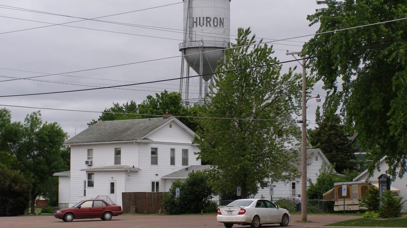
South Dakota: Huron
> Population: 13,291
> Median home value: $89,900 (state: $159,100)
> Poverty rate: 21.6% (state: 13.6%)
> 5 yr. avg. unemployment: 1.3% (state: 3.5%)
Huron is a small city of less than 15,000 residents in eastern South Dakota. Though it is not struggling nearly as much as most cities and towns on this list, it ranks as the worst place to live in South Dakota, in part due to low incomes. The median annual household income in the city is $46,884, about $10,000 less than the median household income across the state. Additionally, 21.6% of Huron residents live below the poverty line, compared to 13.6% of South Dakotans.
[in-text-ad]

Tennessee: Knoxville
> Population: 185,429
> Median home value: $128,800 (state: $158,600)
> Poverty rate: 26.2% (state: 16.1%)
> 5 yr. avg. unemployment: 5.9% (state: 5.9%)
Knoxville, one of the largest cities in Tennessee, also ranks as the worst place to live in the state. A relatively dangerous place, there were 799 violent crimes reported in Knoxville for every 100,000 people in 2018, well above the violent crime rates of 624 per 100,000 statewide and 381 per 100,000 nationwide. Other social problems in the city include a high incidence rate of fatal drug overdoses. There are about 53 drug deaths for every 100,000 people in Knox County annually, nearly double the statewide rate of 28 per 100,000.
Poverty is also relatively common in Knoxville. More than one in every four city residents live on poverty level incomes, compared to 16.1% of state residents.
[recirclink id=723793]
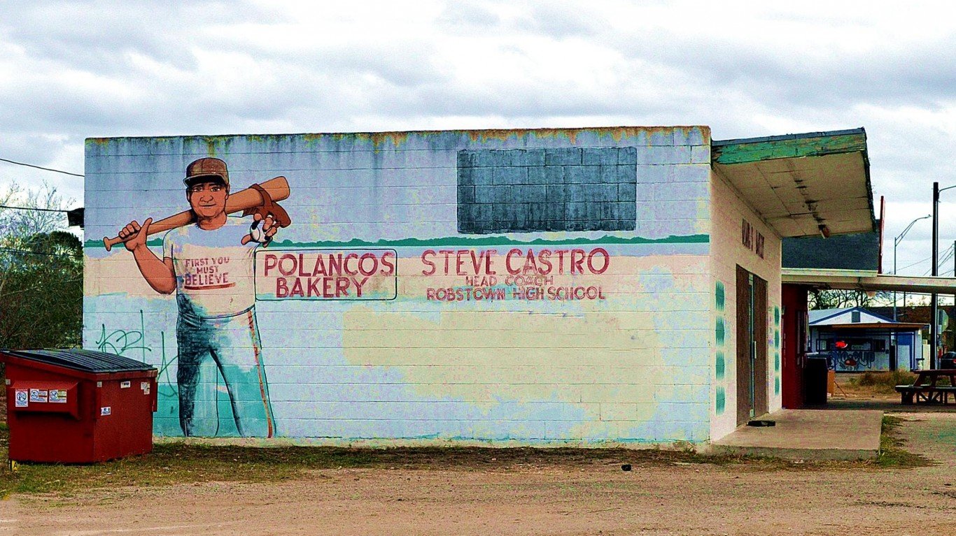
Texas: Robstown
> Population: 11,494
> Median home value: $52,900 (state: $161,700)
> Poverty rate: 41.1% (state: 15.5%)
> 5 yr. avg. unemployment: 20.0% (state: 5.4%)
Robstown, Texas, is one of the poorest places in the United States. The typical household in the south Texas city earns just $29,218 a year, and over 40% of the local population lives below the poverty line. Meanwhile, across Texas, the typical household earns $59,570 annually, and 15.5% of the population lives in poverty. Financial insecurity is due in part to a lack of jobs, as workers in the city are about four times more likely to be unemployed than they are across the state as a whole.
Utah: Vernal
> Population: 10,653
> Median home value: $163,500 (state: $256,700)
> Poverty rate: 20.8% (state: 10.3%)
> 5 yr. avg. unemployment: 8.8% (state: 3.9%)
The poverty rate in Vernal, Utah of 20.8% is more than twice as high as the poverty rate statewide. It is also well above the 14.1% U.S. poverty rate. Vernal’s median household income of $51,301 a year is over $17,000 lower than the state’s median.
Workers in the northeastern Utah city may struggle to find higher-paying work because a relatively low share of adults have a college education. Just 16.1% of adults 25 and older hold at least a bachelor’s degree, well below the 33.3% share of state residents.
[in-text-ad-2]
Vermont: Barre
> Population: 8,711
> Median home value: $154,300 (state: $223,700)
> Poverty rate: 26.6% (state: 11.2%)
> 5 yr. avg. unemployment: 6.3% (state: 4.1%)
Barre, Vermont, a small city just south of Montpelier, ranks as the worst place to live in the state. The city has the highest violent crime rate in Vermont — 837 incidents for every 100,000 people. Meanwhile, the violent crime rate across Vermont as a whole is just 172 per 100,000. With a poverty rate of 26.6%, more than double the 11.2% state poverty rate, Barre is also one of the poorest places in Vermont.
People have been leaving Barre faster than they have been coming in in recent years. Over the last half decade, the city’s population has declined by 3.2%.
Virginia: Franklin
> Population: 8,211
> Median home value: $168,300 (state: $264,900)
> Poverty rate: 16.2% (state: 10.9%)
> 5 yr. avg. unemployment: 15.0% (state: 5.0%)
Franklin, a small city in southern Virginia, ranks as the worst place to live in the state. Housing is far less affordable in Franklin than it is across the state. The typical home in the area is worth $168,300, 4.2 times more than the local median annual household income of $40,375. Across the state, the typical home is worth $264,900, or just 3.7 times the median household income of $71,564.
Economic conditions in Franklin are also generally weaker than they are across Virginia. For example, workers in the city are three times more likely to be unemployed than those across the state as a whole.
[in-text-ad]
Washington: Parkland
> Population: 37,185
> Median home value: $205,500 (state: $311,700)
> Poverty rate: 16.7% (state: 11.5%)
> 5 yr. avg. unemployment: 9.4% (state: 5.3%)
Parkland, Washington, is located in the western part of the state, about 40 miles south of Seattle. As is the case in many cities and towns on this list, joblessness is a problem in Parkland. The average unemployment rate over the last five years has been 9.4%, well above the comparable 5.3% average rate across the state. For those who are working, incomes are generally low. The median household income in the Census designated place is $51,415 annually, about $19,000 less than the statewide median.
[recirclink id=723248]

West Virginia: Huntington
> Population: 47,420
> Median home value: $97,100 (state: $115,000)
> Poverty rate: 32.7% (state: 17.8%)
> 5 yr. avg. unemployment: 7.2% (state: 6.7%)
Due to its economic and health challenges, Huntington ranks not just as the worst city to live in West Virginia, but one of the worst in the country. As the U.S. population increased 3.6% during the last five years, the population of Huntington contracted by 3.5%. Good economic opportunities are scarce in the city. The city’s median household income of $30,362 annually is about half of the U.S. median and about $14,600 less than the state median. Nearly one in three residents live below the poverty line compared to 17.8% of all West Virginians.
Huntington is the county seat of Cabell County, which has the most severe drug problem in the country. The county reported 135 drug deaths per 100,000 residents annually from 2016 to 2018. Over the same period, there were 22 drug deaths per 100,000 residents nationwide and 53 per 100,000 across West Virginia.
Wisconsin: Beloit
> Population: 36,813
> Median home value: $87,400 (state: $173,600)
> Poverty rate: 24.1% (state: 11.9%)
> 5 yr. avg. unemployment: 9.4% (state: 4.0%)
Beloit, Wisconsin, located in the southern part of the state, relies heavily on tourism. Still, the local job market is relatively weak. Beloit residents are more than twice as likely to be unemployed as the typical Wisconsin resident.
Beloit also struggles with a higher than average concentration of serious crimes like robbery and aggravated assault. There were 465 violent crimes in the city for every 100,000 people in 2018, compared to 295 per 100,000 across Wisconsin.
[in-text-ad-2]
Wyoming: Rawlins
> Population: 8,975
> Median home value: $162,800 (state: $213,300)
> Poverty rate: 13.2% (state: 11.1%)
> 5 yr. avg. unemployment: 4.4% (state: 4.5%)
Rawlins, a small city in southern Wyoming, is one of the most dangerous cities in the state. There were 420 violent crimes in the city for every 100,000 people in 2018, compared to 212 per 100,000 across Wyoming as a whole. Though the unemployment rate in Rawlins is in line with the state average, jobs have been disappearing from the city in recent years. There are 10.5% fewer people working in Rawlins now than there were five years ago.
Property values can be indicative of an area’s desirability as a place to live. In Rawlins, most homes are worth less than $163,000. Meanwhile, most homes in Wyoming are worth more than $213,000.
Methodology:
To identify the worst cities to live in, 24/7 Wall St. created a weighted index of 25 measures across four categories: affordability, economy, quality of life, and community.
1.) The affordability category consists of three measures:
- The ratio of median home value to median household income, at one-fourth weight.
- Median property taxes paid as a percentage of median home value, at one-fourth weight.
- Regional price parity, a measure of cost of living, at one-fourth weight.
2.) The economy category consists of four measures:
- Median home value, at full weight.
- Employment growth from 2014 to 2018, at one-half weight.
- The ratio of the number of employed workers to the total population, at one-half weight.
- The unemployment rate, at triple weight.
3.) The quality of life category consists of six measures:
- The poverty rate, at four times weight.
- The share of the population in urban census tracts at least 1 mile from a grocery store and in rural census tracts at least 10 miles from a grocery store, a measure of poor food access, at full weight.
- The distance from the city center to the nearest hospital, at full weight.
- The percentage of patients discharged from acute care hospitals who are readmitted to the hospital within 30 days, at one-fourth weight.
- The percentage of heart attack, coronary artery bypass grafting (CABG) surgery, chronic obstructive pulmonary disease (COPD), heart failure, pneumonia, and stroke patients who pass away within 30 days of treatment, at full weight.
- The number of drug-related fatalities per 100,000 residents, at double weight.
4.) The community category consists of 12 measures:
- The percentage of workers 16 and over commuting by public transit, walking, or other non-car means, at one-half weight.
- The average travel time to work, at one-fourth weight.
- The number of hospital admissions for conditions that could be treated in an outpatient setting per 1,000 Medicare enrollees — an indication of poor outpatient care and overuse of hospitals — at one-half weight.
- The number of violent crimes — homicide, rape, robbery, and aggravated assault — reported per 100,000 residents, at full weight.
- The number of property crimes — burglary, larceny, motor vehicle theft, and arson — reported per 100,000 residents, at full weight.
- The number of movie theaters per 100,000 residents, at one-tenth weight.
- The number of libraries and archives per 100,000 residents, at one-tenth weight.
- The number of theater companies and dinner theaters per 100,000 residents, at one-tenth weight.
- The number of museums per 100,000 residents, at one-tenth weight.
- The number of nature parks and similar institutions per 100,000 residents, at one-tenth weight.
- The number of alcoholic drinking places per 100,000 residents, at one-tenth weight.
- The number of restaurants and other eating places per 100,000 residents, at one-tenth weight.
Data on population, employment, unemployment, median home value, median household income, median property taxes paid, commuter characteristics, average travel time to work, and poverty came from the U.S. Census Bureau’s American Community Survey and are five-year estimates for the period 2014 to 2018. Employment data used to calculate five-year employment growth are five-year estimates for the years 2010 to 2014. Data on cost of living came from real estate analysis company ATTOM Data Solutions and is for the year 2014.
Data on the share of the population in urban census tracts or areas at least 1 mile from a grocery store and in rural census tracts at least 10 miles from a grocery store, a measure of poor food access, came from the U.S. Department of Agriculture’s 2017 update to the Food Access Research Atlas and is at the county level.
Data on hospital locations came from the Centers for Medicare & Medicaid Services. Data on 30-day readmission rates and 30-day mortality rates also came from the CMS and are for the period July 2016 to June 2019. Data was aggregated to the city level for cities with at least one hospital, and was aggregated to the county level for cities with no hospitals. Data on the number of drug-related deaths per 100,000 residents per year from the period 2016 to 2018 is from the Centers for Disease Control and Prevention and is at the county level. Data on preventable hospitalizations per 1,000 Medicare enrollees came from the 2020 County Health Rankings and Roadmaps program, a collaboration between the Robert Wood Johnson Foundation and University of Wisconsin Population Health Institute, and is at the county level.
Data on the number of violent crimes and property crimes reported per 100,000 residents came from the FBI’s Uniform Crime Reporting Program and are for the year 2018.
Data on the number of movie theaters, libraries and archives, theater companies and dinner theaters, museums, nature parks and other similar institutions, alcoholic beverage drinking places, and restaurants and other eating places came from the Census Bureau’s 2018 County Business Patterns series and is at the county level.
To avoid geographic clustering, we only took the lowest-ranking city in a given county. Our list includes cities, towns, villages, boroughs, and Census designated places. We did not include places with fewer than 8,000 residents in our analysis. We also excluded places with more than 20% enrollment in college and graduate school as well as places where more than 20% of the population is employed in the armed forces, based on five-year data from the 2018 ACS.
Contact [email protected] for any questions or corrections.